2.6.1. Introduction to Data Visualization
1. Introduction
Data visualization is the graphical representation of data to help us understand patterns, trends, and insights. In R, data visualization is a core skill for both exploratory data analysis and for communicating results. Good visualizations make complex data accessible and actionable.
2. Why Data Visualization Matters
- Makes data easier to interpret and understand.
- Reveals patterns, trends, and outliers.
- Supports decision-making and communication.
- Essential for both exploratory analysis and explanatory reporting.
3. General Features of Good Plots
- Clearly-labeled axes.
- Text that is large enough to read.
- Axes that are not misleading.
- Data displayed appropriately for its type (categorical, continuous, etc.).
- Clean legends and titles.
4. Exploratory vs. Explanatory Plots
Exploratory Plots
- Purpose: Help analysts quickly understand and explore the data.
- Characteristics:
- Created rapidly, often with minimal formatting.
- Used to spot trends, outliers, and data quality issues.
- Axes and legends are labeled but may not be fully polished.
- Typically used during the initial phase of analysis.
- Many are generated as you iterate through different questions.
- Example:
# Quick scatter plot to check lab results distribution ggplot(labs, aes(x = LBTEST, y = LBORRES)) + geom_point()- Outcome: A basic scatter plot showing lab results by test, useful for spotting patterns or errors.
Explanatory Plots
- Purpose: Communicate findings and insights to others (stakeholders, publication, presentation).
- Characteristics:
- Carefully designed for clarity, aesthetics, and accuracy.
- Axes, legends, and titles are descriptive and easy to read.
- Colors, sizes, and themes are chosen for maximum impact.
- Only a few are created for each project, but each is highly polished.
- Used in reports, presentations, and publications.
- Example:
# Presentation-ready plot with clear labels and legend ggplot(labs, aes(x = LBTEST, y = LBORRES, color = USUBJID)) + geom_point(size = 4) + labs( title = "Lab Results by Test and Subject", x = "Lab Test", y = "Lab Result (LBORRES)", color = "Subject ID" ) + theme_minimal(base_size = 14) + theme(legend.position = "top")- Outcome: A visually appealing plot, ready for sharing with an audience, with clear differentiation by subject and all elements labeled.
Summary Table: Exploratory vs. Explanatory
| Feature | Exploratory Plot | Explanatory Plot |
|---|---|---|
| Purpose | Data exploration | Communication of results |
| Formatting | Minimal, quick | Polished, detailed |
| Axes/Labels | Basic, functional | Clear, descriptive, large |
| Audience | Analyst (yourself) | Stakeholders, publication |
| Quantity | Many per project | Few per project |
| Example | Quick scatter plot | Presentation-ready plot |
5. Exploratory Plot Example
R Code:
library(ggplot2)
labs <- data.frame(
  USUBJID = rep(c("01-701-101", "01-701-102"), each = 3),
  LBTEST = rep(c("ALT", "AST", "HGB"), 2),
  LBORRES = c(35, 40, 13.5, 38, 32, 14.2)
)
ggplot(labs, aes(x = LBTEST, y = LBORRES)) +
  geom_point()
- Description:
- Quick scatter plot of lab results by test.
- Axes are labeled, but plot is not yet polished.
Input Table:
| USUBJID | LBTEST | LBORRES |
|---|---|---|
| 01-701-101 | ALT | 35 |
| 01-701-101 | AST | 40 |
| 01-701-101 | HGB | 13.5 |
| 01-701-102 | ALT | 38 |
| 01-701-102 | AST | 32 |
| 01-701-102 | HGB | 14.2 |
Expected Outcome:
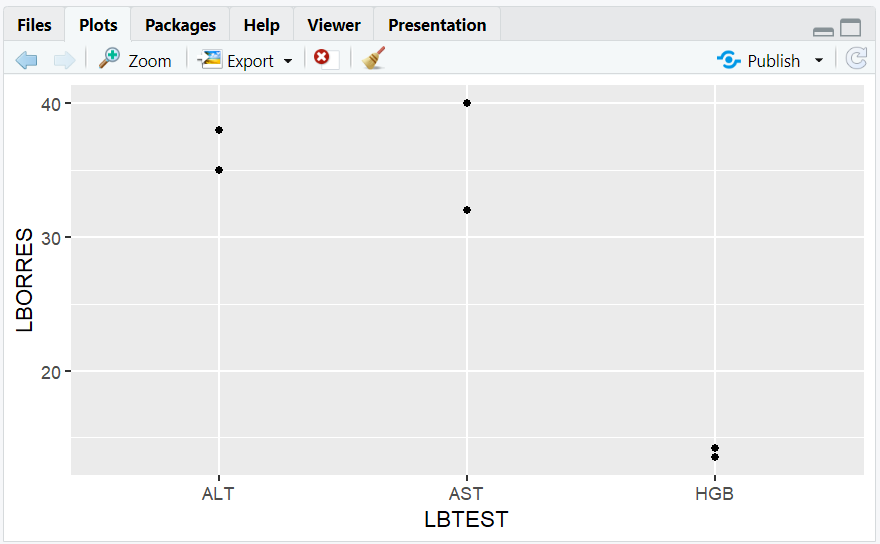
- A scatter plot showing lab results for each test.
6. Explanatory Plot Example
R Code:
ggplot(labs, aes(x = LBTEST, y = LBORRES, color = USUBJID)) +
  geom_point(size = 4) +
  labs(
    title = "Lab Results by Test and Subject",
    x = "Lab Test",
    y = "Lab Result (LBORRES)",
    color = "Subject ID"
  ) +
  theme_minimal(base_size = 14) +
  theme(legend.position = "top")
- Description:
- Polished plot with clear labels, larger points, legend, and title.
- Suitable for presentations or reports.
Expected Outcome:
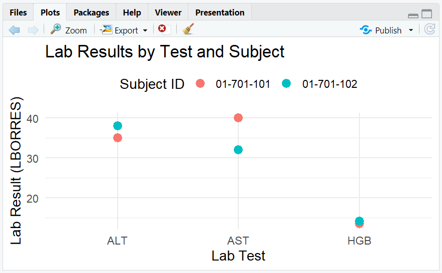
- A visually appealing plot, easy to interpret, with clear subject differentiation.
**Resource download links**
2.6.1.-Introduction-to-Data-Visualization.zip
⁂