2.6.2. Data Plot Types in R
1. Introduction
There are many types of plots available in R, each suited for different types of data and questions. Choosing the right plot type is essential for effective data exploration and communication. In this section, we’ll cover the most common plot types, show how to create them in R, and discuss when to use each.
2. Common Plot Types
- Histogram
- Density Plot
- Scatterplot
- Barplot
- Grouped Barplot
- Stacked Barplot
- Boxplot
- Line Plot
3. Example Dataset
We’ll use an SDTM-style dataset containing subject IDs, height, weight, and sex.
R Code:
sdtm <- data.frame(
  USUBJID = c("01-701-101", "01-701-102", "01-701-103", "01-701-104", "01-701-105",
              "01-701-106", "01-701-107", "01-701-108", "01-701-109", "01-701-110",
              "01-701-111", "01-701-112", "01-701-113", "01-701-114", "01-701-115"),
  HEIGHT = c(182, 180, 170, 165, 175, 160, 185, 172, 168, 178, 162, 174, 169, 177, 166),
  WEIGHT = c(77, 64, 59, 72, 70, 55, 85, 68, 60, 75, 58, 66, 62, 74, 63),
  SEX = c("M", "M", "F", "F", "M", "F", "M", "F", "F", "M", "F", "F", "F", "M", "F")
)
head(sdtm)
Input Table:
| USUBJID | HEIGHT | WEIGHT | SEX |
|---|---|---|---|
| 01-701-101 | 182 | 77 | M |
| 01-701-102 | 180 | 64 | M |
| 01-701-103 | 170 | 59 | F |
| 01-701-104 | 165 | 72 | F |
| 01-701-105 | 175 | 70 | M |
| 01-701-106 | 160 | 55 | F |
| 01-701-107 | 185 | 85 | M |
| 01-701-108 | 172 | 68 | F |
| 01-701-109 | 168 | 60 | F |
| 01-701-110 | 178 | 75 | M |
| 01-701-111 | 162 | 58 | F |
| 01-701-112 | 174 | 66 | F |
| 01-701-113 | 169 | 62 | F |
| 01-701-114 | 177 | 74 | M |
| 01-701-115 | 166 | 63 | F |
4. Histogram
- Purpose: Visualize the distribution of a single numeric variable.
- When to use: To see the range, shape, and frequency of values.
R Code:
hist(sdtm$HEIGHT, main = "Histogram of Heights", xlab = "Height (cm)")
Expected Outcome:
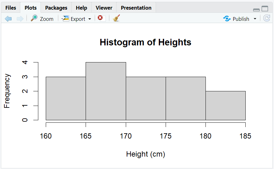
A histogram showing the distribution of heights, with most people between 150 and 200 cm.
5. Density Plot
- Purpose: Show the smoothed distribution of a numeric variable.
- When to use: To understand the shape of the distribution without binning.
R Code:
plot(density(sdtm$HEIGHT), main = "Density Plot of Heights", xlab = "Height (cm)")
Expected Outcome:
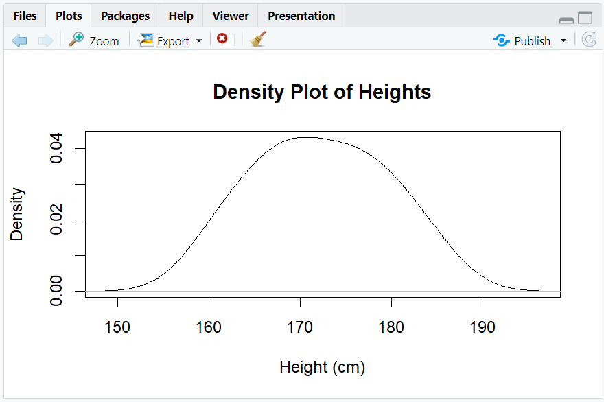
A smooth curve showing the distribution of heights.
6. Scatterplot
- Purpose: Visualize the relationship between two numeric variables.
- When to use: To see if two variables are correlated.
R Code:
plot(sdtm$WEIGHT, sdtm$HEIGHT, main = "Scatterplot of Weight vs Height",
     xlab = "Weight (kg)", ylab = "Height (cm)")
Expected Outcome:
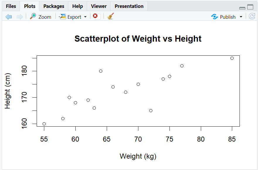
A scatterplot showing that taller people tend to weigh more.
7. Barplot
- Purpose: Show counts for each category of a categorical variable.
- When to use: To compare the size of groups.
R Code:
barplot(table(sdtm$SEX), main = "Barplot of Sex", ylab = "Count")
Expected Outcome:
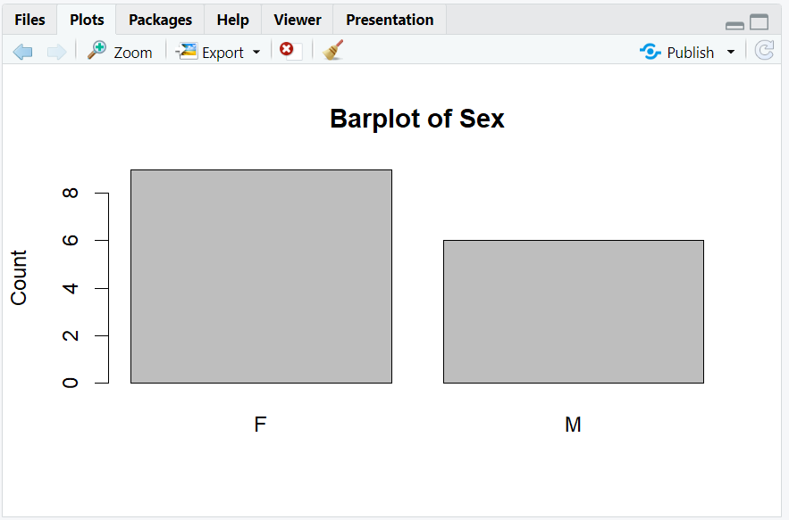
A barplot showing the number of males and females in the dataset.
8. Grouped Barplot
- Purpose: Compare counts across two categorical variables.
- When to use: To see breakdowns by group.
R Code:
library(ggplot2)
ggplot(sdtm, aes(x = SEX, fill = cut(HEIGHT, breaks = 3))) +
  geom_bar(position = "dodge") +
  labs(title = "Grouped Barplot: Sex by Height Group", fill = "Height Group")
Expected Outcome:
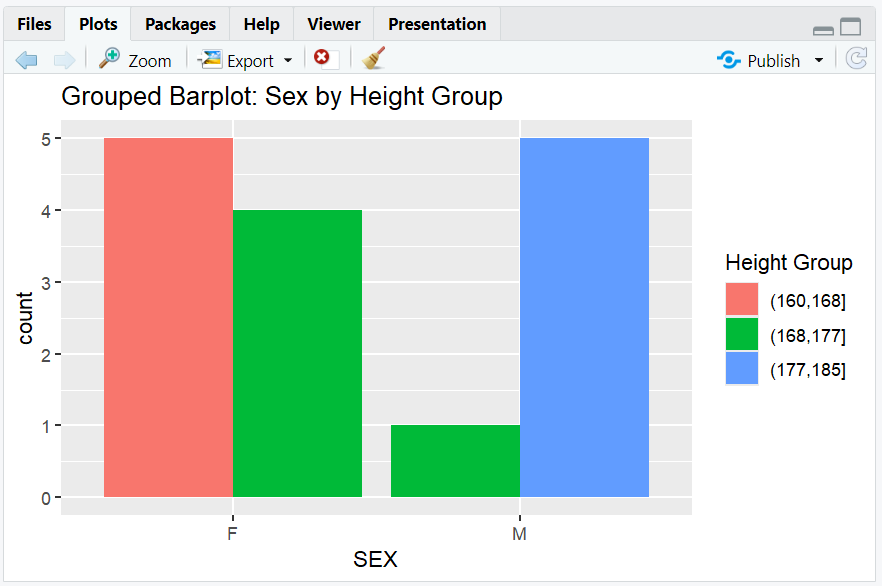
A grouped barplot showing counts of males and females by height group.
9. Stacked Barplot
- Purpose: Show composition of groups within a category.
- When to use: To see how subgroups contribute to the total.
R Code:
ggplot(sdtm, aes(x = SEX, fill = cut(HEIGHT, breaks = 3))) +
  geom_bar(position = "stack") +
  labs(title = "Stacked Barplot: Sex by Height Group", fill = "Height Group")
Expected Outcome:
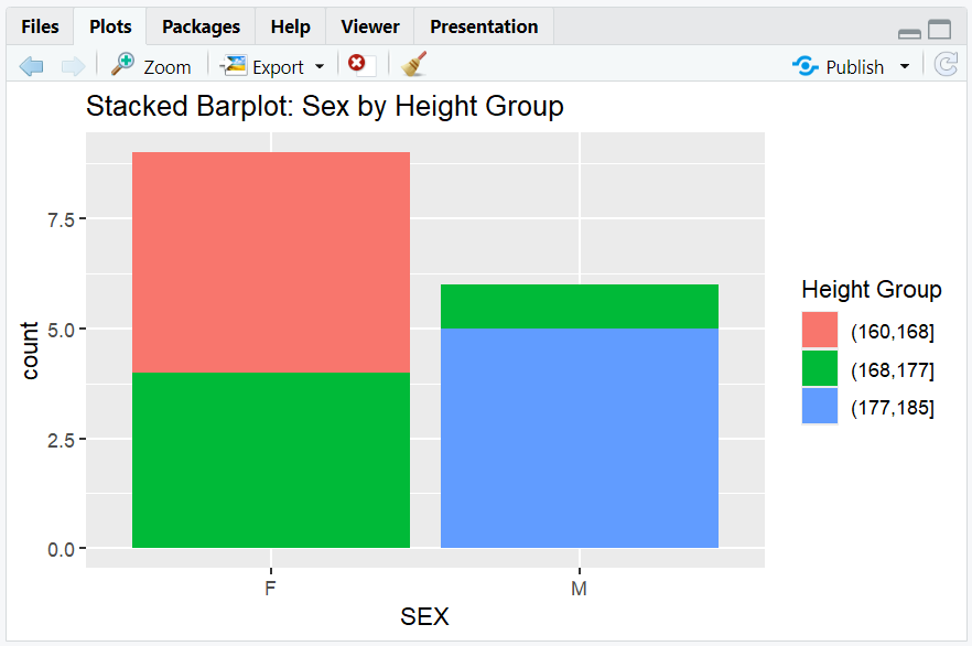
A stacked barplot showing the same data as above, but stacked.
10. Boxplot
- Purpose: Summarize the distribution of a numeric variable by category.
- When to use: To compare medians, ranges, and outliers between groups.
R Code:
boxplot(HEIGHT ~ SEX, data = sdtm, main = "Boxplot of Height by Sex",
        xlab = "Sex", ylab = "Height (cm)")
Expected Outcome:
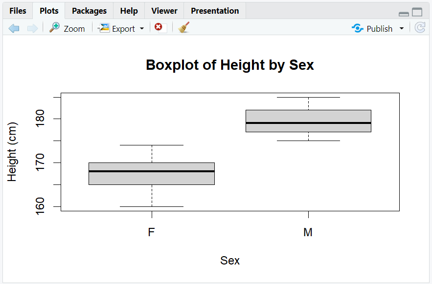
A boxplot showing the median, quartiles, and outliers for height by sex.
11. Line Plot
- Purpose: Show trends over time or ordered categories.
- When to use: To visualize changes or trends.
R Code:
# Example: Simulate average weight by height group
height_group <- c("150-160", "161-170", "171-180", "181-190")
avg_weight <- c(55, 60, 70, 75)

plot(seq_along(height_group), avg_weight, type = "o",
     main = "Average Weight by Height Group",
     xlab = "Height Group (cm)",
     ylab = "Average Weight (kg)",
     xaxt = "n")
axis(1, at = seq_along(height_group), labels = height_group)
Expected Outcome:
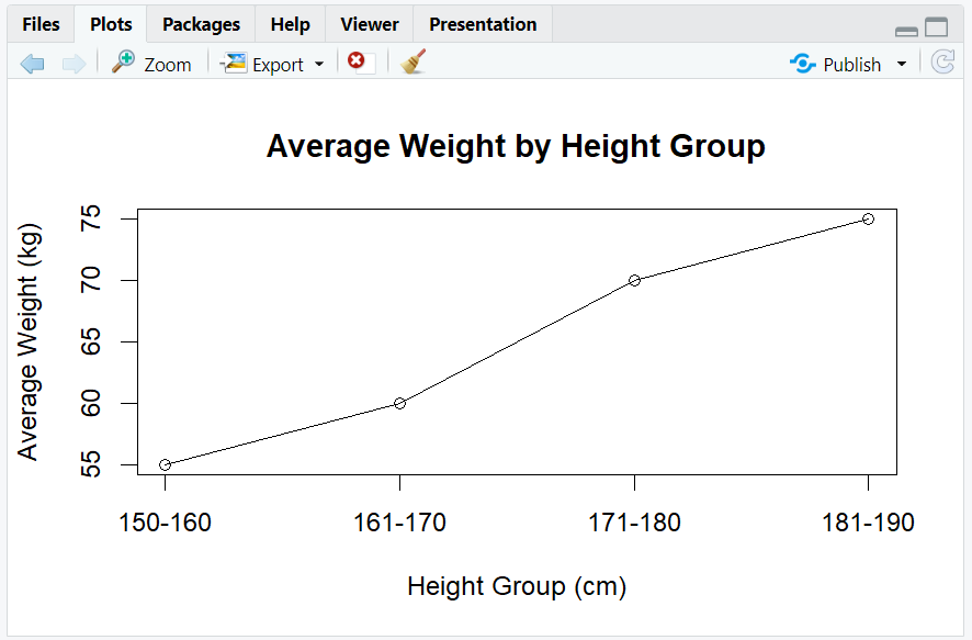
A line plot showing average weight across height groups.
12. Exploring Beyond Basic Plot Types
- Use
facet_wrap()orfacet_grid()in ggplot2 for multi-panel plots. - Add color, shape, and size aesthetics for more dimensions.
- Use interactive plots with
plotlyorggiraph. - Combine plots with
patchworkorcowplot. - Explore more plot types at R Graph Gallery.
13. Practice Problems
- Create a histogram of weights from the
sdtmdataset. - Make a density plot of heights by sex using
ggplot2. - Create a scatterplot of height vs. weight, colored by sex.
- Make a grouped barplot of sex by height group.
- Draw a boxplot of weight by height group.
14. Further Reading and Resources
**Resource download links**
2.6.2.-Data-Plot-Types-in-R.zip