2.6.4. Introduction to ggplot2
1. Introduction
ggplot2 is R’s most popular and powerful package for data visualization. It implements the "grammar of graphics," allowing you to build complex plots by layering components. Each plot is constructed by adding layers, such as data, geoms (plot types), aesthetics, and more.
2. Why Use ggplot2?
- Highly flexible and customizable.
- Consistent syntax for all plot types.
- Supports layering: add titles, labels, themes, and more.
- Integrates well with tidyverse data workflows.
- Publication-quality graphics.
- Easily extendable with additional packages like
ggthemes,ggrepel, andpatchwork.
3. The Grammar of Graphics and Layered Approach
- Data: The dataset you want to visualize.
- Geom: The type of plot (e.g., points, lines, bars).
- Aesthetics (aes): How variables are mapped to visual properties (e.g., x, y, color).
- Layers: Each line of code (separated by
+) adds a new layer or feature to the plot.
General Syntax:
ggplot(data = DATASET) +
  geom_PLOT_TYPE(mapping = aes(VARIABLES)) +
  additional_layers
- Start with
ggplot(), specify your data. - Add a geom (e.g.,
geom_point,geom_bar). - Map variables using
aes(). - Add additional layers like titles, themes, or annotations.
4. Example Dataset: ADaM
We’ll use an ADaM-style dataset containing subject IDs, treatment groups, baseline weight, and change from baseline weight.
R Code:
adam <- data.frame(
  USUBJID = c("01-701-101", "01-701-102", "01-701-103", "01-701-104", "01-701-105"),
  TRT = c("Placebo", "Drug A", "Drug A", "Placebo", "Drug B"),
  BASEWT = c(70, 80, 65, 75, 85),
  CHGWT = c(-2, -5, 3, 0, -4)
)
head(adam)
Input Table:
| USUBJID | TRT | BASEWT | CHGWT |
|---|---|---|---|
| 01-701-101 | Placebo | 70 | -2 |
| 01-701-102 | Drug A | 80 | -5 |
| 01-701-103 | Drug A | 65 | 3 |
| 01-701-104 | Placebo | 75 | 0 |
| 01-701-105 | Drug B | 85 | -4 |
5. Your First ggplot2 Plot: Scatterplot
R Code:
ggplot(data = adam) +
  geom_point(mapping = aes(x = BASEWT, y = CHGWT))
- Description:
- Plots baseline weight (
BASEWT) vs. change from baseline weight (CHGWT) for each subject. - Each point represents a subject.
- Plots baseline weight (
Expected Outcome:
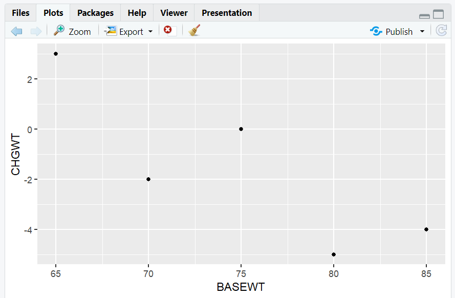
A scatterplot showing the relationship between baseline weight and change from baseline weight.
6. Adding Layers: Titles, Colors, and More
You can add layers to enhance your plot.
R Code:
ggplot(data = adam) +
  geom_point(mapping = aes(x = BASEWT, y = CHGWT, color = TRT)) +
  labs(
    title = "Change in Weight by Baseline Weight and Treatment",
    x = "Baseline Weight (kg)",
    y = "Change from Baseline Weight (kg)",
    color = "Treatment Group"
  ) +
  theme_minimal()
- Description:
- Adds color by treatment group (
TRT). - Adds a title and axis labels.
- Uses a minimal theme for a clean look.
- Adds color by treatment group (
Expected Outcome:
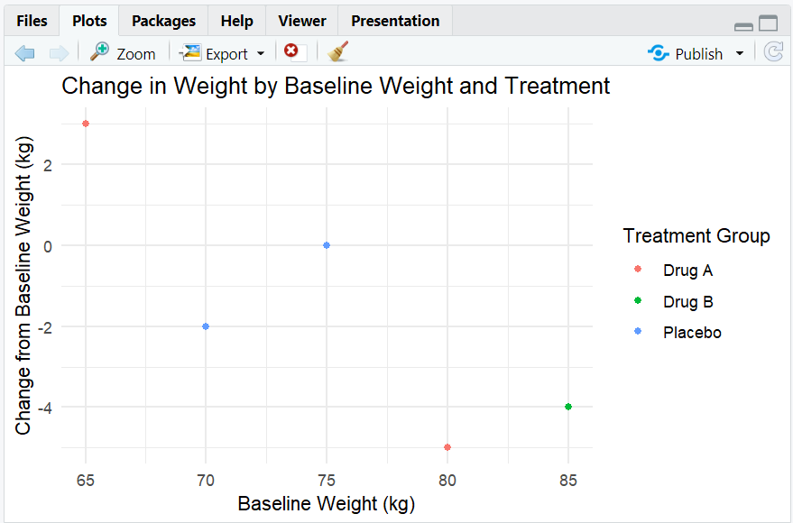
A colored scatterplot, with a legend for treatment groups, and clear labels.
7. Boxplot: Change in Weight by Treatment
R Code:
ggplot(data = adam) +
  geom_boxplot(mapping = aes(x = TRT, y = CHGWT, fill = TRT)) +
  labs(
    title = "Boxplot of Change in Weight by Treatment",
    x = "Treatment Group",
    y = "Change from Baseline Weight (kg)"
  ) +
  theme_light()
- Description:
- Creates a boxplot of change from baseline weight (
CHGWT) by treatment group (TRT). - Adds fill color by treatment group.
- Creates a boxplot of change from baseline weight (
Expected Outcome:
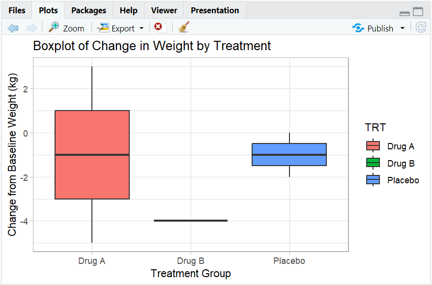
A boxplot showing the distribution of weight changes for each treatment group.
8. Barplot: Count of Subjects by Treatment
R Code:
ggplot(data = adam) +
  geom_bar(mapping = aes(x = TRT, fill = TRT)) +
  labs(
    title = "Barplot of Subject Count by Treatment",
    x = "Treatment Group",
    y = "Count"
  ) +
  theme_classic()
- Description:
- Creates a barplot showing the number of subjects in each treatment group.
Expected Outcome:
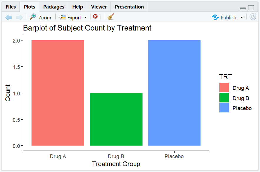
A barplot showing the count of subjects for each treatment group.
9. Line Plot: Simulated Mean Weight Change Over Time
R Code:
time <- c(0, 4, 8, 12)
mean_chg <- data.frame(
  TIME = rep(time, 3),
  MEAN_CHG = c(0, -1, -2, -3, 0, -2, -4, -6, 0, -1, -3, -5),
  TRT = rep(c("Placebo", "Drug A", "Drug B"), each = 4)
)

ggplot(data = mean_chg) +
  geom_line(mapping = aes(x = TIME, y = MEAN_CHG, color = TRT, group = TRT)) +
  labs(
    title = "Mean Weight Change Over Time by Treatment",
    x = "Time (Weeks)",
    y = "Mean Change from Baseline Weight (kg)",
    color = "Treatment Group"
  ) +
  theme_minimal()
- Description:
- Creates a line plot showing the mean weight change over time for each treatment group.
Expected Outcome:
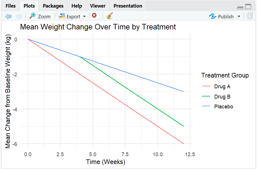
A line plot showing trends in mean weight change over time for each treatment group.
10. Exploring Beyond Basic ggplot2
- Add multiple geoms (e.g., points and smooth lines).
- Use
facet_wrap()to create small multiples by category. - Customize themes and color palettes.
- Add annotations and highlights.
- Save plots with
ggsave().
R Code Example: Faceting
ggplot(adam, aes(x = BASEWT, y = CHGWT, color = TRT)) +
  geom_point() +
  facet_wrap(~ TRT) +
  labs(
    title = "Baseline Weight vs. Change by Treatment",
    x = "Baseline Weight (kg)",
    y = "Change from Baseline Weight (kg)"
  )
- Expected Outcome:
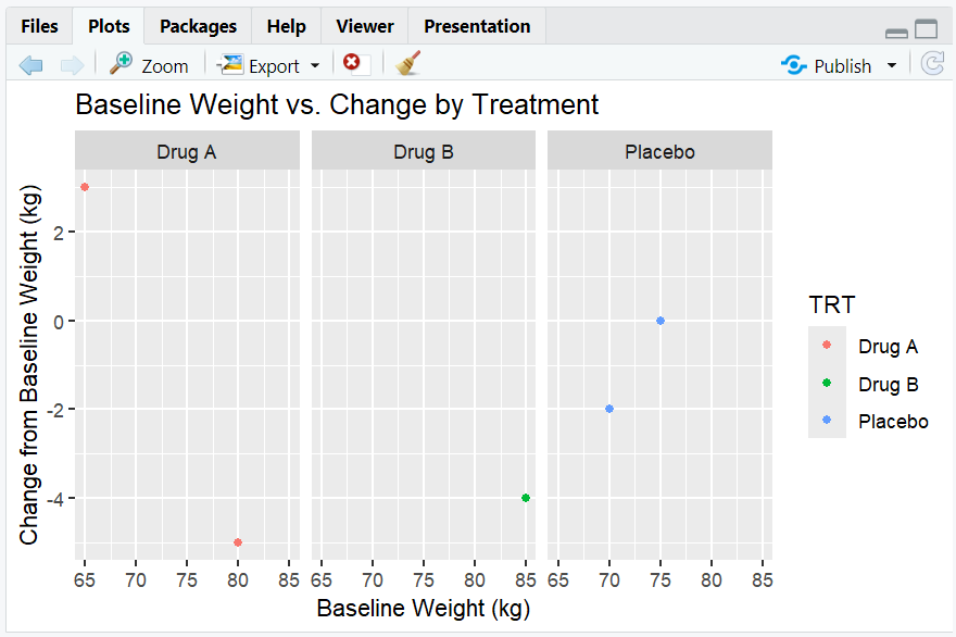
- Multiple scatterplots, one for each treatment group.
11. Practice Problems
- Create a barplot of the number of subjects by treatment group.
- Make a boxplot of baseline weight by treatment group.
- Add a title and axis labels to a scatterplot of baseline weight vs. change from baseline weight.
- Use
facet_wrap()to show baseline weight vs. change by sex (add aSEXcolumn to the dataset). - Save a plot as a PNG file using
ggsave().
12. Further Reading and Resources
- ggplot2 documentation
- R for Data Science: Data Visualization
- R Graph Gallery: ggplot2 Section
- Fundamentals of Data Visualization
**Resource download links**
2.6.4.-Introduction-to-ggplot2.zip