2.6.5. Scatterplots in ggplot2
1. Introduction
Scatterplots are a fundamental plot type for visualizing the relationship between two numeric variables. In clinical data analysis (e.g., ADaM or SDTM datasets), scatterplots are often used to explore relationships such as age vs. cholesterol, lab values vs. baseline, or other continuous endpoints. In ggplot2, scatterplots are created using geom_point(). This section demonstrates how to build, customize, and interpret scatterplots using clinical data.
2. Creating a Basic Scatterplot
- Use
geom_point()to plot two numeric variables from a clinical dataset. - The
xargument sets the variable on the x-axis;ysets the y-axis.
R Code:
library(ggplot2)
# Example ADaM-like dataset with easy-to-understand variables
adam <- data.frame(
USUBJID = paste0("SUBJ", 1:30),
AGE = sample(30:80, 30, replace = TRUE),
HEIGHT = round(rnorm(30, mean = 165, sd = 10), 1), # in cm
WEIGHT = round(rnorm(30, mean = 70, sd = 12), 1) # in kg
)
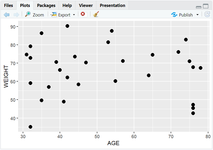
ggplot(data = adam) +
geom_point(mapping = aes(x = AGE, y = WEIGHT))
Expected Outcome:
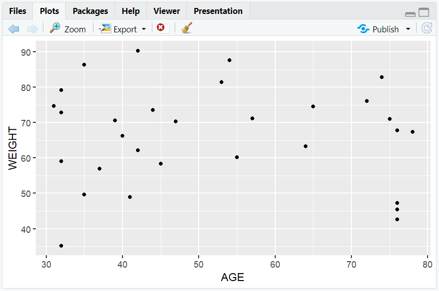
A scatterplot showing the relationship between patient age and weight.
3. Customizing Scatterplots with Aesthetics
- Aesthetics control how points look (color, size, shape).
- Map clinical variables to aesthetics inside
aes()to visualize additional dimensions.
Point Color by Sex
set.seed(123)
adam$SEX <- sample(c("M", "F"), nrow(adam), replace = TRUE)
ggplot(data = adam) +
  geom_point(mapping = aes(x = AGE, y = WEIGHT, color = SEX))
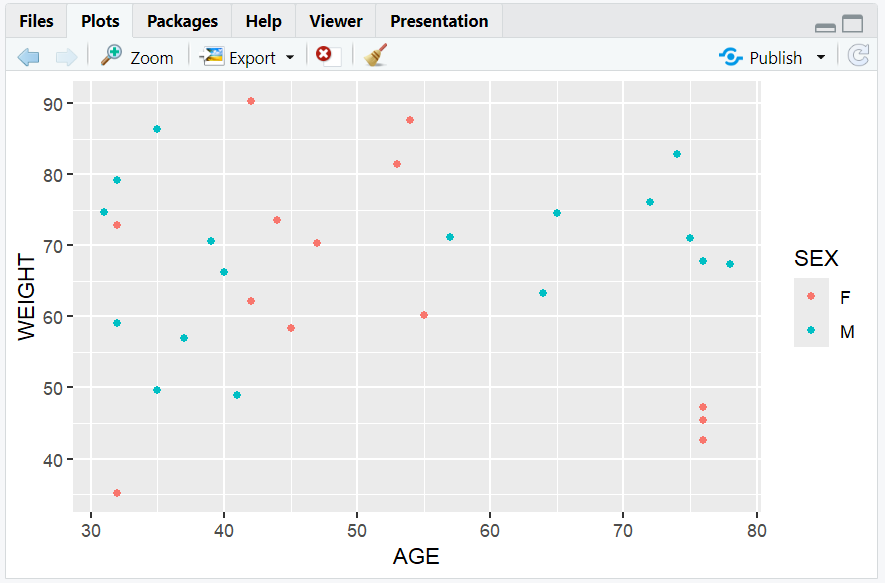
- Colors points by sex, adding a legend automatically.
Point Size by Height
ggplot(data = adam) +
  geom_point(mapping = aes(x = AGE, y = WEIGHT, size = HEIGHT))
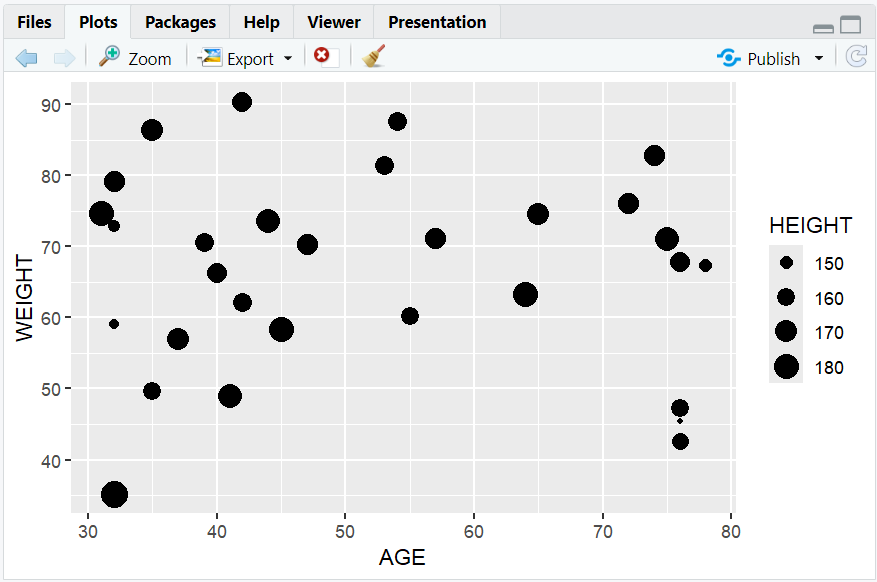
- Maps height to point size (useful for highlighting taller subjects).
Manual Point Color
ggplot(data = adam) +
  geom_point(mapping = aes(x = AGE, y = WEIGHT), color = "blue")
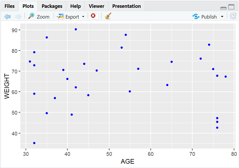
- All points are colored blue (set outside
aes()).
Manual Point Size
ggplot(data = adam) +
  geom_point(mapping = aes(x = AGE, y = WEIGHT), size = 3)
- All points are larger (set outside
aes()).
Point Shape by Sex
ggplot(data = adam) +
  geom_point(mapping = aes(x = AGE, y = WEIGHT, shape = SEX))
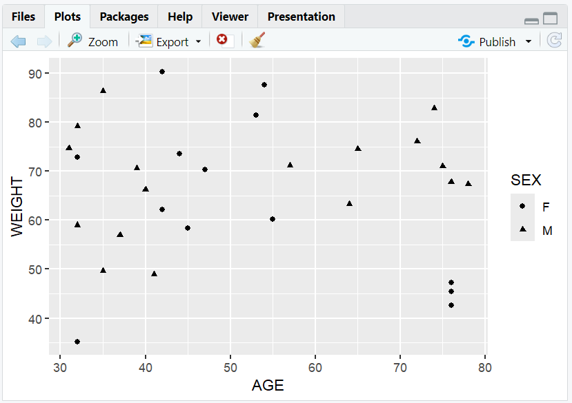
- Maps sex to shape.
Manual Point Shape
ggplot(data = adam) +
  geom_point(mapping = aes(x = AGE, y = WEIGHT), shape = 17)
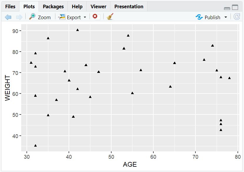
- All points are triangles.
4. Faceting: Breaking Down by Category
- Faceting creates subplots for each level of a clinical variable (e.g., sex).
- Use
facet_wrap()to split the scatterplot by a variable.
R Code:
ggplot(data = adam) +
  geom_point(mapping = aes(x = AGE, y = WEIGHT)) +
  facet_wrap(~SEX)
Expected Outcome:
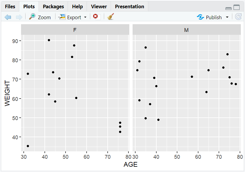
Two scatterplots, one for each sex, showing age vs. weight.
5. Input and Output Table for Scatterplot Variations
| R Code Example | Input Data | Output (Plot/Description) |
|---|---|---|
geom_point() |
adam | Basic scatterplot |
color = SEX |
adam | Colored by sex |
size = HEIGHT |
adam | Size by height |
facet_wrap(~SEX) |
adam | Subplots by sex |
6. Exploring Beyond Basic Scatterplots
- Add trend lines with
geom_smooth(). - Use transparency (
alpha) to reduce overplotting. - Combine with other geoms (e.g.,
geom_jitter()). - Annotate points with
geom_text()orgeom_label(). - Save your plot with
ggsave().
R Code Example: Add a Trend Line
ggplot(adam, aes(x = AGE, y = WEIGHT)) +
  geom_point(alpha = 0.6) +
  geom_smooth(method = "lm", color = "red")
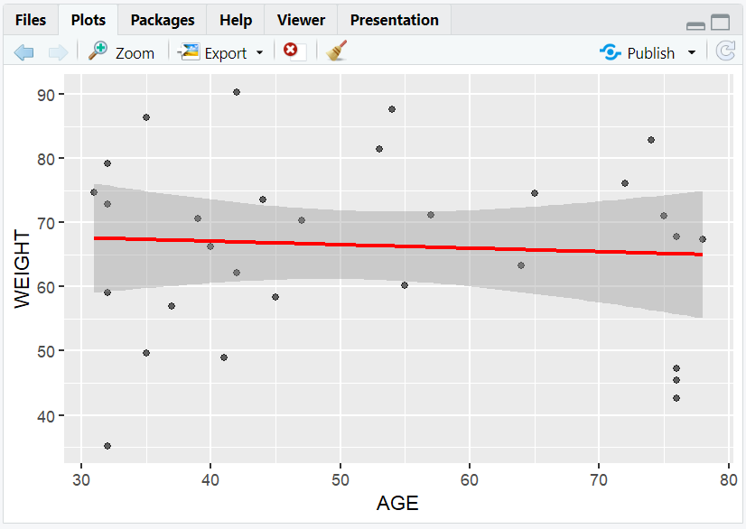
- Adds a linear regression line to the scatterplot.
7. Practice Problems
- Create a scatterplot of weight vs. age, colored by sex.
- Make a scatterplot with point size mapped to height.
- Facet a scatterplot by sex.
- Add a trend line to a scatterplot.
- Save your scatterplot as a PNG file.
8. Further Reading and Resources
**Resource download links**
2.6.5.-Scatterplots-in-ggplot2.zip