2.6.10. Legends in ggplot2
1. Introduction
Legends are essential for interpreting the colors, shapes, and fills used in your ggplot2 plots. A well-designed legend helps viewers understand what each visual element represents, making your plots more accessible and informative.
2. Why Legends Matter
- Clarify what colors, shapes, or sizes represent in your plot.
- Help viewers decode categorical and continuous variables.
- Essential for multi-group or multi-variable plots.
- Legends can be customized for clarity and presentation.
3. Customizing Legend Titles
- Use
labs()to set the legend title when mapping a variable to color or fill. - Use
guides()andguide_legend()for more advanced control.
R Code:
library(ggplot2)
# Example ADaM-like dataset
adsl <- data.frame(
  USUBJID = paste0("SUBJ", 1:100),
  TRT = sample(c("Placebo", "Active"), 100, replace = TRUE),
  SEX = sample(c("M", "F"), 100, replace = TRUE),
  AGEGRP = sample(c("<40", "40-59", "60+"), 100, replace = TRUE)
)
ggplot(adsl) +
  geom_bar(aes(x = AGEGRP, fill = TRT), position = "fill") +
  scale_fill_manual(values = c("dodgerblue", "orange")) +
  labs(
    title = "Treatment Distribution by Age Group",
    subtitle = "Proportion of subjects by treatment and age group"
  ) +
  ylab("Proportion") +
  theme_classic() +
  theme(
    title = element_text(size = 16),
    axis.text = element_text(size = 14),
    axis.title = element_text(size = 16, face = "bold")
  ) +
  guides(fill = guide_legend("Treatment Arm"))
Expected Outcome:
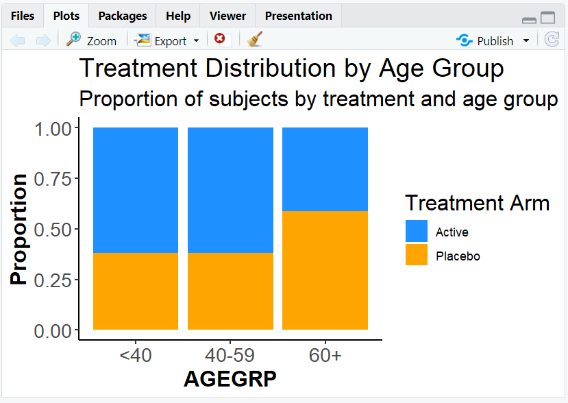
A proportion barplot with a custom legend title ("Treatment Arm").
4. Adjusting Legend Layout
- Control the number of columns or rows in the legend using
guide_legend(ncol = ..., nrow = ...). - Useful for wide or tall legends, especially with many categories.
R Code:
ggplot(adsl) +
  geom_bar(aes(x = AGEGRP, fill = TRT), position = "fill") +
  scale_fill_manual(values = c("dodgerblue", "orange")) +
  guides(fill = guide_legend("Treatment Arm", ncol = 2))
Expected Outcome:
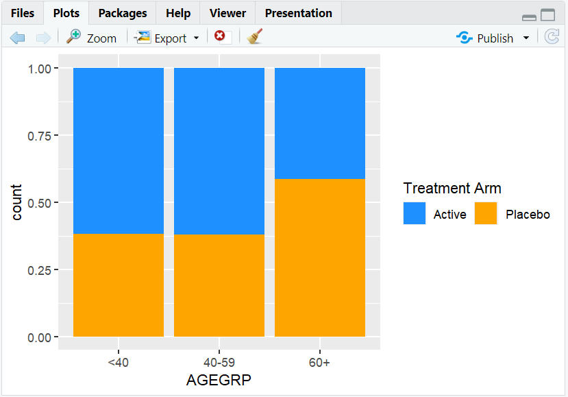
A legend with two columns, making it more compact.
5. Styling the Legend
- Use
theme()to change the appearance of the legend title, text, and background. - Example: Make the legend title bold and larger, or add a border.
R Code:
ggplot(adsl) +
  geom_bar(aes(x = AGEGRP, fill = TRT), position = "fill") +
  scale_fill_manual(values = c("dodgerblue", "orange")) +
  guides(fill = guide_legend("Treatment Arm")) +
  theme(
    legend.title = element_text(size = 14, face = "bold"),
    legend.text = element_text(size = 12),
    legend.background = element_rect(color = "black", fill = "white")
  )
Expected Outcome:
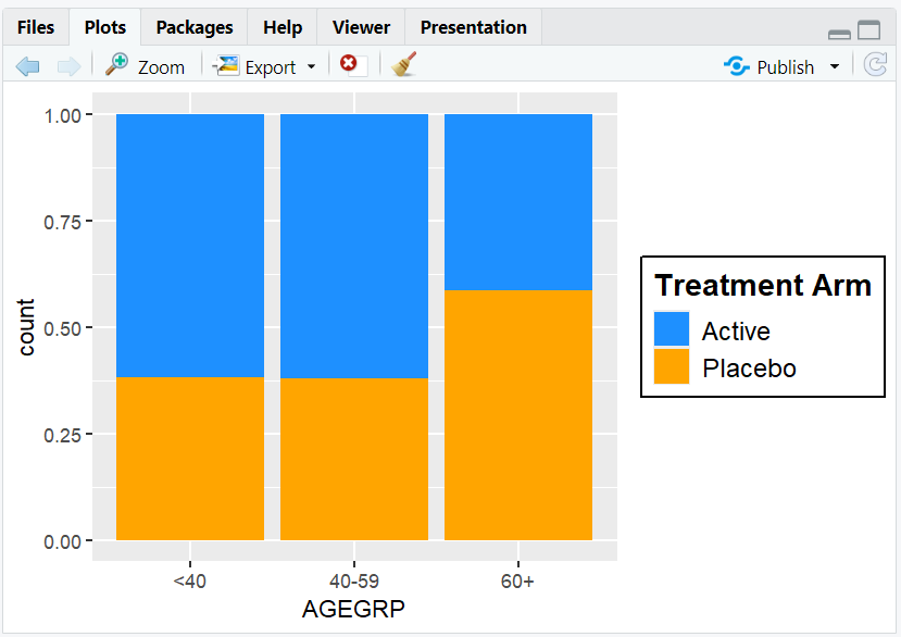
A plot with a bold, large legend title and a boxed legend.
6. Input and Output Table for Legend Examples
| R Code Example | Input Data | Output (Plot/Description) |
|---|---|---|
guides(fill = guide_legend("Treatment Arm")) |
adsl | Custom legend title |
guide_legend(ncol = 2) |
adsl | Legend with two columns |
theme(legend.title = ...) |
adsl | Styled legend title |
theme(legend.background = ...) |
adsl | Legend with border |
7. Exploring Beyond Basic Legends
- Move the legend with
theme(legend.position = "bottom"),"top","left", or"right". - Remove the legend with
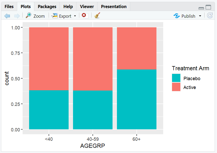
theme(legend.position = "none"). - Reverse the order of legend items with
guides(fill = guide_legend(reverse = TRUE)). - Combine multiple legends or split them using
guides().
R Code Example:
ggplot(adsl) +
  geom_bar(aes(x = AGEGRP, fill = TRT), position = "fill") +
  guides(fill = guide_legend("Treatment Arm", reverse = TRUE)) +
  theme(legend.position = "bottom")
8. Practice Problems
- Change the legend title for a scatterplot colored by SEX.
- Arrange the legend in two rows for a barplot of AGEGRP.
- Make the legend text larger and bold.
- Move the legend to the bottom of a plot.
- Remove the legend from a plot.
9. Further Reading and Resources
- ggplot2 documentation: guides()
- ggplot2 documentation: guide_legend()
- R Graph Gallery: Legends
- R for Data Science: Data Visualization
**Resource download links**
2.6.10.-Legends-in-ggplot2.zip
⁂