2.6.11. Scales in ggplot2
1. Introduction
Scales in ggplot2 control how data values are mapped to visual properties like position, color, and size. Adjusting scales allows you to customize axis breaks, labels, transformations, and more, making your clinical plots clearer and more informative.
# Dummy ADSL data
set.seed(123)
adsl <- data.frame(
  USUBJID = sprintf("SUBJ%03d", 1:200),
  AGE = round(rnorm(200, mean = 50, sd = 10)),
  SEX = sample(c("M", "F"), 200, replace = TRUE),
  RACE = sample(c("White", "Black", "Asian", "Other"), 200, replace = TRUE),
  TRT01A = sample(c("Placebo", "Drug A", "Drug B"), 200, replace = TRUE)
)
2. Why Adjust Scales?
- Control the number and placement of axis ticks and labels.
- Transform axes (e.g., log, sqrt) for better visualization of clinical data ranges.
- Format axis labels (e.g., add units or percent).
- Specify the order and inclusion of discrete categories (e.g., treatment arms).
- Improve interpretability and presentation quality for clinical reports.
3. Continuous Scales: scale_x_continuous and scale_y_continuous
- Use
scale_x_continuous()andscale_y_continuous()to control numeric axes. - Set custom breaks, labels, and transformations.
R Code:
ggplot(adsl) +
  geom_histogram(aes(x = AGE), binwidth = 5) +
  scale_x_continuous(breaks = seq(20, 80, by = 10))
- Description:
- Sets x-axis breaks every 10 years for AGE.
Expected Outcome:
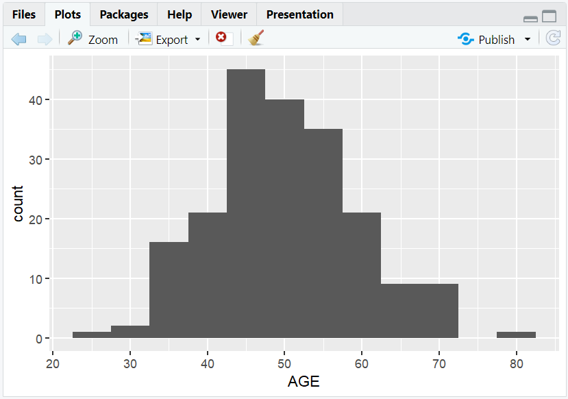
A histogram of AGE with x-axis ticks at every 10 years.
4. Axis Transformations with trans
- Use the
transargument to transform axes (e.g., log, sqrt). - Useful for skewed clinical measurements (e.g., lab values).
R Code:
ggplot(adsl) +
  geom_histogram(aes(x = AGE), binwidth = 5) +
  scale_x_continuous(trans = "sqrt") +
  labs(x = "Age (sqrt scale)", y = "Count")
- Description:
- x-axis is displayed on a sqrt scale.
Expected Outcome:

A histogram with a square root x-axis for AGE.
5. Applying Scales to Boxplots
- Transform axes to better compare groups with different value ranges (e.g., lab values by treatment).
R Code:
ggplot(adsl) +
  geom_boxplot(aes(y = AGE, x = TRT01A))
- Description:
- Standard boxplot of AGE by treatment group.

R Code:
ggplot(adsl) +
  geom_boxplot(aes(y = AGE, x = TRT01A)) +
  scale_y_continuous(trans = "log10") +
  labs(y = "Age (log10 scale)", x = "Treatment Group")
- Description:
- Boxplot with y-axis on a log10 scale for better comparison.
Expected Outcome:

Boxplots of AGE by treatment group, easier to compare if AGE is skewed.
6. Formatting Axis Labels
- Use the
labelsargument with functions from thescalespackage to format axis labels (e.g., add units, percent).
R Code:
library(scales)
ggplot(adsl) +
  geom_boxplot(aes(y = AGE, x = TRT01A)) +
  scale_y_continuous(labels = function(x) paste0(x, " yrs")) +
  labs(y = "Age (years)", x = "Treatment Group")
- Description:
- y-axis labels are formatted with "yrs" for years.
Expected Outcome:

Boxplot with y-axis labels like "30 yrs", "40 yrs", etc.
7. Discrete Scales: scale_x_discrete and scale_y_discrete
- Use
scale_x_discrete()andscale_y_discrete()to control categorical axes. - Limit which categories are shown and their order (e.g., only selected treatment arms).
R Code:
ggplot(adsl) +
  geom_bar(aes(x = TRT01A)) +
  scale_x_discrete(limits = c("Placebo", "Drug A", "Drug B"))
- Description:
- Only shows Placebo, Drug A, and Drug B on the x-axis.
Expected Outcome:
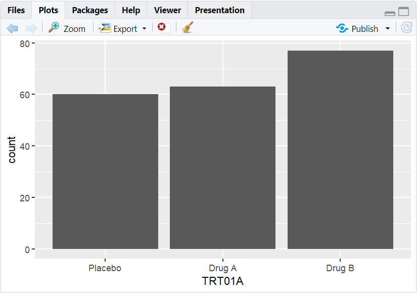
A barplot with only selected treatment groups.
8. Input and Output Table for Scale Examples
| R Code Example | Input Data | Output (Plot/Description) |
|---|---|---|
scale_x_continuous(breaks = ...) |
adsl | Custom x-axis breaks for AGE |
scale_x_continuous(trans = "log10") |
adsl | Log-scaled x-axis for AGE |
scale_y_continuous(labels = ...) |
adsl | Custom-formatted y-axis labels |
scale_x_discrete(limits = ...) |
adsl | Limited x-axis categories (treatment) |
9. Exploring Beyond Basic Scales
- Use
scale_color_manual()andscale_fill_manual()for custom color mapping (e.g., by SEX or RACE). - Explore other transformations:
sqrt,reverse,log2, etc. - Use
scalespackage for advanced label formatting (percent, comma, scientific). - Combine multiple scale adjustments for highly customized clinical plots.
10. Practice Problems
- Set x-axis breaks at every 5 years for a histogram of AGE.
- Make a barplot of SEX with y-axis on a log2 scale.
- Format y-axis labels as percent in a barplot of RACE proportions.
- Limit a boxplot to only two treatment groups.
- Use a custom function to label AGE axis ticks with "years".
11. Further Reading and Resources
- ggplot2 documentation: Scales
- scales package documentation
- R Graph Gallery: Axis and Scales
- R for Data Science: Data Visualization
- Fundamentals of Data Visualization
**Resource download links**
⁂