2.6.9. Themes in ggplot2
1. Introduction
Themes in ggplot2 control the overall appearance of your plots, including backgrounds, gridlines, fonts, and spacing. Using themes, you can quickly change the look and feel of your visualizations to match your needs, whether for publication, presentation, or exploration.
2. Why Use Themes?
- Instantly change the style of your plot with a single function.
- Improve readability and aesthetics for different audiences.
- Make your plots consistent across a project or publication.
- Customize every visual aspect of your plot.
3. Built-in ggplot2 Themes
ggplot2 comes with several built-in themes, including:
theme_gray()(default)theme_bw()theme_classic()theme_minimal()theme_light()theme_dark()theme_void()theme_linedraw()
Each theme changes the background, gridlines, and other non-data elements.
4. Applying a Theme
- Add a theme layer to your plot to change its appearance.
R Code:
library(ggplot2)
# Example ADaM-like dataset
adam <- data.frame(
  USUBJID = paste0("SUBJ", 1:100),
  AGE = sample(18:80, 100, replace = TRUE),
  HEIGHT = round(rnorm(100, mean = 165, sd = 10), 1),
  WEIGHT = round(rnorm(100, mean = 70, sd = 12), 1),
  SEX = sample(c("M", "F"), 100, replace = TRUE),
  TRT = sample(c("Placebo", "Active"), 100, replace = TRUE)
)
ggplot(adam) +
  geom_bar(aes(x = TRT, fill = SEX), position = "fill") +
  scale_fill_manual(values = c("pink", "lightblue")) +
  labs(
    title = "Treatment Arm Distribution by Sex",
    subtitle = "Proportion of subjects by treatment and sex"
  ) +
  ylab("Proportion") +
  theme_classic()
Expected Outcome:
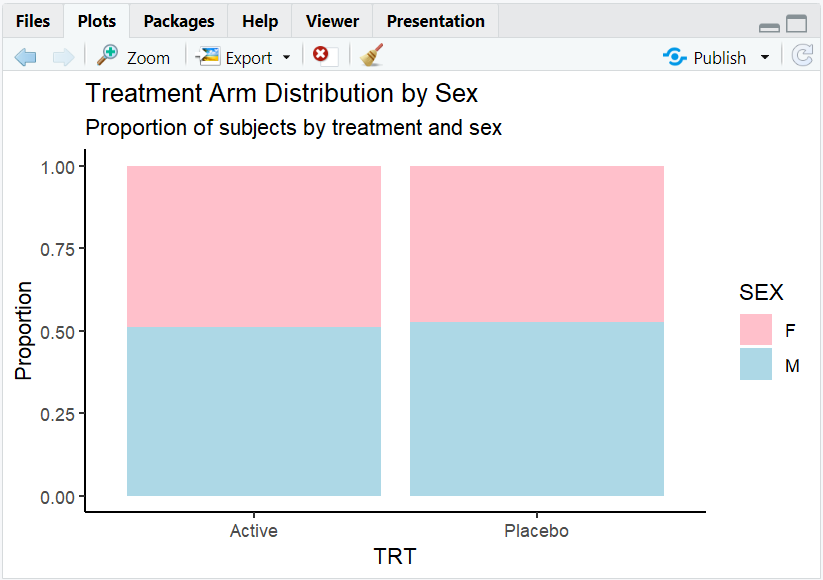
A proportion barplot with a clean, classic look (no gridlines or grey background).
5. Customizing Themes with theme()
- Use the
theme()function to adjust specific elements, such as text size, font, color, and spacing. - Combine with a built-in theme for full control.
R Code:
ggplot(adam) +
  geom_bar(aes(x = TRT, fill = SEX), position = "fill") +
  scale_fill_manual(values = c("pink", "lightblue")) +
  labs(
    title = "Treatment Arm Distribution by Sex",
    subtitle = "Proportion of subjects by treatment and sex"
  ) +
  ylab("Proportion") +
  theme_classic() +
  theme(
    title = element_text(size = 16),
    axis.text = element_text(size = 14),
    axis.title = element_text(size = 16, face = "bold")
  )
Expected Outcome:
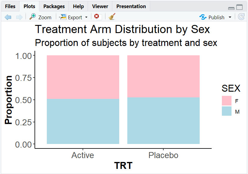
A plot with larger, bold axis titles and bigger text for readability.
6. Exploring Beyond Basic Themes
- Use the
ggthemespackage for additional themes (e.g.,theme_economist(),theme_fivethirtyeight()). - Create your own custom theme for consistent branding.
- Adjust spacing, legend position, background color, and more with
theme(). - Combine multiple theme elements for a unique look.
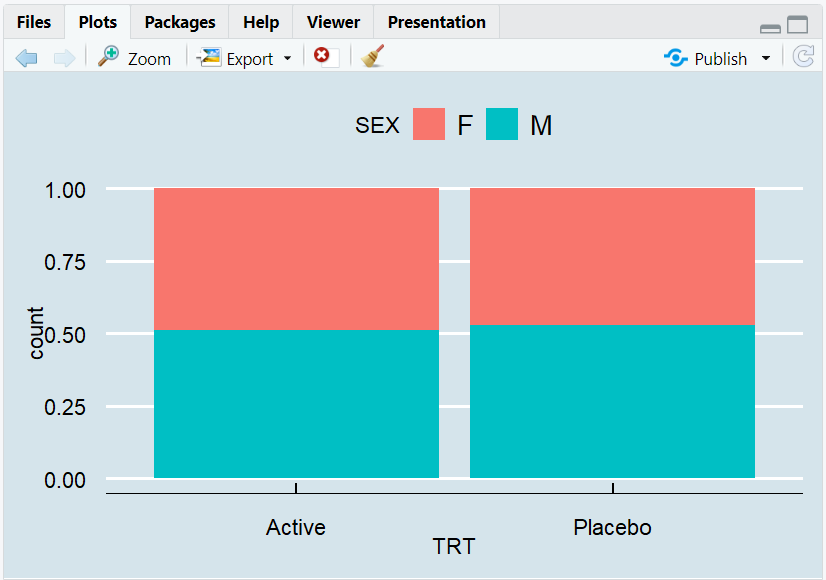
R Code Example:
library(ggthemes)
ggplot(adam) +
  geom_bar(aes(x = TRT, fill = SEX), position = "fill") +
  theme_economist()
7. Input and Output Table for Theme Examples
| R Code Example | Input Data | Output (Plot/Description) |
|---|---|---|
theme_classic() |
adam | Classic, clean plot |
theme_minimal() |
adam | Minimalist plot |
theme() customization |
adam | Custom font sizes, bold text |
theme_economist() |
adam | Economist magazine style |
8. Practice Problems
- Apply
theme_minimal()to a scatterplot of weight vs. age. - Make axis titles bold and larger using
theme(). - Change the legend position to the bottom of a barplot.
- Use a theme from the
ggthemespackage. - Create a plot with a custom background color.
9. Further Reading and Resources
- ggplot2 documentation: Themes
- ggthemes package
- R Graph Gallery: Themes
- R for Data Science: Data Visualization
- Fundamentals of Data Visualization
**Resource download links**
⁂