2.6.12. Coordinate Adjustment in ggplot2
1. Introduction
Coordinate adjustment in ggplot2 allows you to change the orientation and aspect of your plots. This is especially useful for flipping axes, zooming in on a region, or creating specialized visualizations like pie charts. The most common function for this is coord_flip(), but there are others such as coord_cartesian() and coord_polar().
# Dummy ADSL data
set.seed(123)
adsl <- data.frame(
  USUBJID = sprintf("SUBJ%03d", 1:200),
  AGE = round(rnorm(200, mean = 50, sd = 10)),
  SEX = sample(c("M", "F"), 200, replace = TRUE),
  RACE = sample(c("White", "Black", "Asian", "Other"), 200, replace = TRUE),
  TRT01A = sample(c("Placebo", "Drug A", "Drug B"), 200, replace = TRUE)
)
2. Why Adjust Coordinates?
- Flip axes for better readability (e.g., horizontal bar charts).
- Zoom in on a specific region of the plot.
- Change the aspect ratio or create circular plots.
- Improve the presentation and interpretation of your clinical data.
3. Flipping Axes with coord_flip()
coord_flip()swaps the x- and y-axes.- Useful for horizontal barplots, boxplots, or when labels are long.
R Code:
ggplot(adsl) +
  geom_bar(aes(x = RACE)) +
  scale_y_continuous(breaks = seq(0, 80, by = 10)) +
  scale_x_discrete(limits = c("White", "Black", "Asian")) +
  coord_flip() +
  labs(
    title = "Number of Subjects by Race",
    subtitle = "Subset of all subjects, looking at three races"
  ) +
  ylab("Count") +
  theme_classic()
Expected Outcome:

A horizontal barplot showing counts for selected race categories.
4. Combining Layers with coord_flip()
- All other ggplot2 layers (themes, labels, scales) work with
coord_flip(). - You can build up your plot as usual, then flip the coordinates at the end.
R Code:
p <- ggplot(adsl) +
  geom_bar(aes(x = RACE, fill = TRT01A)) +
  scale_y_continuous(breaks = seq(0, 40, by = 5)) +
  scale_x_discrete(limits = c("White", "Black", "Asian")) +
  coord_flip() +
  labs(
    title = "Number of Subjects by Race and Treatment",
    subtitle = "Subset of all subjects, looking at three races"
  ) +
  theme_classic() +
  theme(
    title = element_text(size = 18),
    axis.text = element_text(size = 14)
  )
p
Expected Outcome:
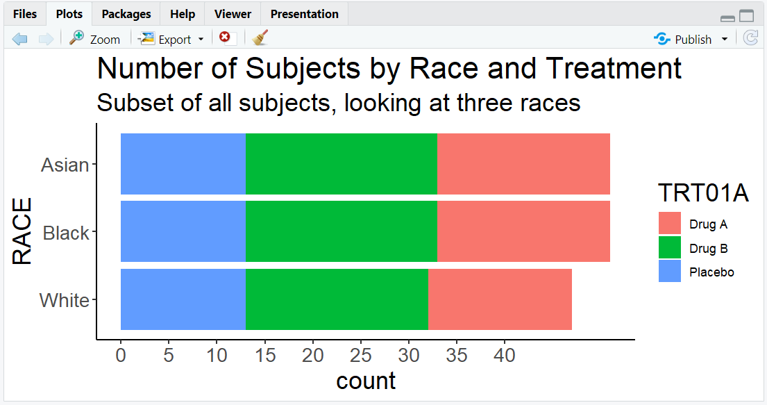
A customized horizontal barplot with large text and clear labels, colored by treatment group.
5. Other Coordinate Adjustments
coord_cartesian(xlim = ..., ylim = ...): Zoom in on a region without removing data.coord_polar(): Convert to polar coordinates (e.g., for pie charts or circular barplots).coord_fixed(ratio = ...): Set a fixed aspect ratio.
R Code Example: Zooming in
ggplot(adsl, aes(x = AGE, y = ..count..)) +
  geom_histogram(binwidth = 2, fill = "skyblue") +
  coord_cartesian(xlim = c(30, 60), ylim = c(0, 25)) +
  labs(title = "Zoomed in on Subjects Aged 30 to 60")
Expected Outcome:
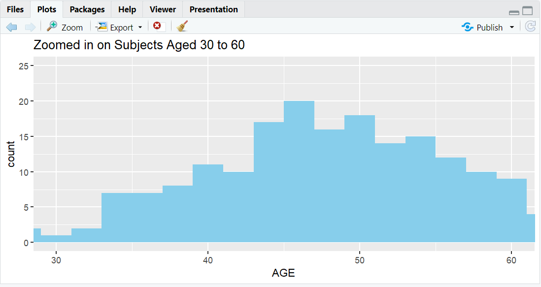
A histogram zoomed in on subjects with AGE between 30 and 60.
R Code Example: Pie Chart
ggplot(adsl, aes(x = "", fill = TRT01A)) +
  geom_bar(width = 1) +
  coord_polar(theta = "y") +
  labs(title = "Treatment Group Distribution (Pie Chart)")
Expected Outcome:
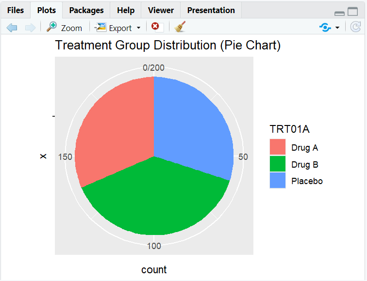
A pie chart showing the distribution of subjects by treatment group.
R Code Example: Fixed Aspect Ratio
ggplot(adsl, aes(x = AGE, y = ..count..)) +
  geom_histogram(binwidth = 2, fill = "orange") +
  coord_fixed(ratio = 1/2) +
  labs(title = "Histogram with Fixed Aspect Ratio")
Expected Outcome:
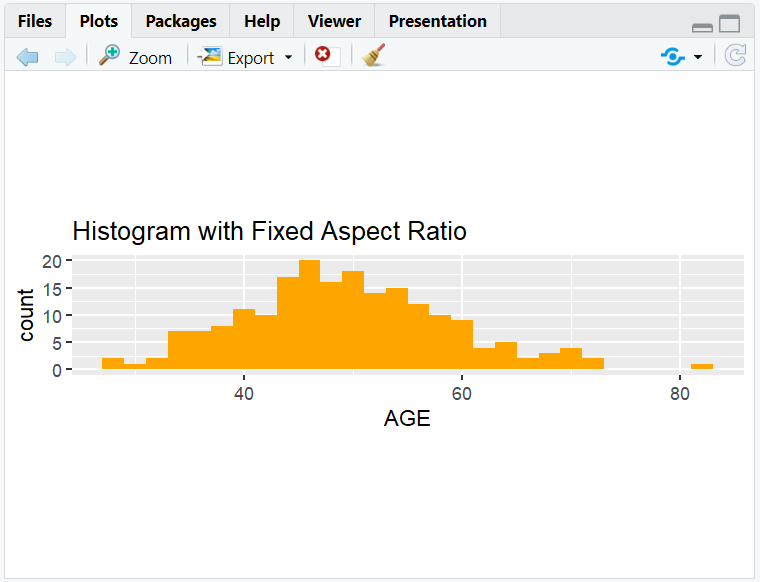
A histogram of AGE with a fixed aspect ratio.
6. Input and Output Table for Coordinate Examples
| R Code Example | Input Data | Output (Plot/Description) |
|---|---|---|
coord_flip() |
adsl | Horizontal barplot |
coord_cartesian() |
adsl | Zoomed-in plot |
coord_polar() |
adsl | Pie/circular plot |
7. Exploring Beyond Basic Coordinate Adjustments
- Use
coord_flip()with boxplots for horizontal boxplots (e.g., AGE by TRT01A). - Combine
coord_cartesian()with facetting for focused comparisons. - Try
coord_polar()for creative visualizations (e.g., treatment group pie chart). - Adjust aspect ratio for clinical plots.
8. Practice Problems
- Flip the axes of a boxplot of AGE by treatment group.
- Zoom in on a histogram of AGE for ages between 40 and 60.
- Create a pie chart of treatment group using
coord_polar(). - Make a horizontal barplot of RACE with custom colors and large labels.
- Set a fixed aspect ratio for a histogram of AGE.
9. Further Reading and Resources
- ggplot2 documentation: coord_flip()
- ggplot2 documentation: coord_cartesian()
- ggplot2 documentation: coord_polar()
- R Graph Gallery: Coordinates
- R for Data Science: Data Visualization
**Resource download links**
2.6.12.-Coordinate-Adjustment-in-ggplot2.zip