2.6.14. Vertical and Horizontal Lines in ggplot2
1. Introduction
Adding vertical and horizontal lines to your plots can help highlight important thresholds, means, medians, or other reference points. In ggplot2, you can use geom_hline() for horizontal lines and geom_vline() for vertical lines.
# Dummy ADSL data for ready-to-run examples
set.seed(123)
adsl <- data.frame(
  USUBJID = sprintf("SUBJ%03d", 1:200),
  AGE = round(rnorm(200, mean = 50, sd = 10)),
  SEX = sample(c("M", "F"), 200, replace = TRUE),
  RACE = sample(c("White", "Black", "Asian", "Other"), 200, replace = TRUE),
  TRT01A = sample(c("Placebo", "Drug A", "Drug B"), 200, replace = TRUE)
)
2. Why Add Reference Lines?
- Emphasize thresholds or cutoffs (e.g., 50% mark, mean, median).
- Highlight specific categories or values.
- Make plots easier to interpret and compare.
- Draw attention to important features or changes.
3. Adding a Horizontal Line with geom_hline()
- Use
geom_hline(yintercept = ...)to add a horizontal line at a specific y-value. - Useful for showing a target, mean, or threshold.
R Code:
library(scales)
ggplot(adsl) +
  geom_bar(aes(x = RACE, fill = TRT01A), position = "fill") +
  scale_fill_manual(values = c("red", "orange", "dodgerblue")) +
  scale_y_continuous(labels = percent_format()) +
  labs(y = "Percent of subjects") +
  geom_hline(yintercept = 0.5, color = "red", size = 1)
Expected Outcome:
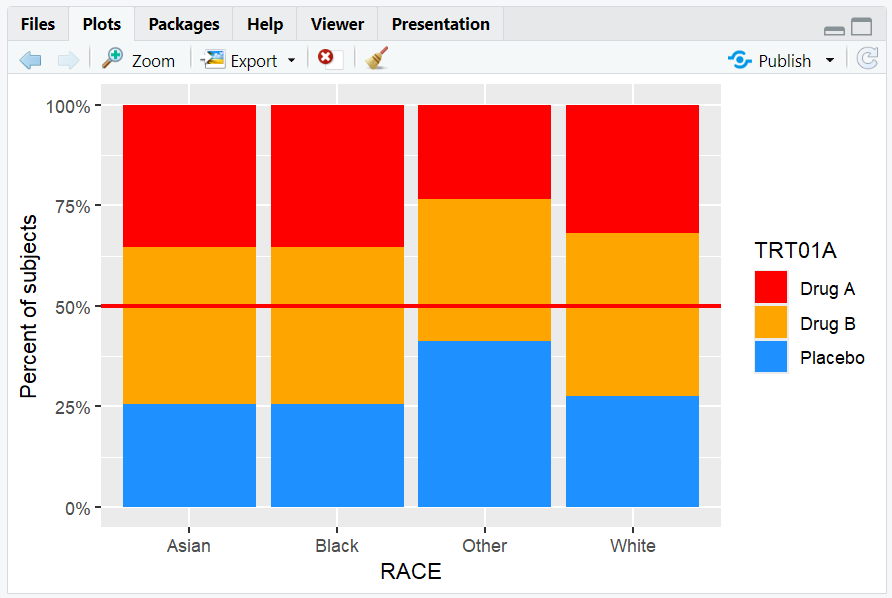
A stacked proportion barplot with a red horizontal line at 50%.
4. Adding a Vertical Line with geom_vline()
- Use
geom_vline(xintercept = ...)to add a vertical line at a specific x-value. - For discrete axes, numeric values correspond to the order of categories.
R Code:
ggplot(adsl) +
  geom_bar(aes(x = RACE, fill = TRT01A), position = "fill") +
  scale_fill_manual(values = c("red", "orange", "dodgerblue")) +
  scale_y_continuous(labels = percent_format()) +
  labs(y = "Percent of subjects") +
  geom_hline(yintercept = 0.5, color = "red", size = 1) +
  geom_vline(xintercept = 2.5, color = "black", size = 0.5)
Expected Outcome:
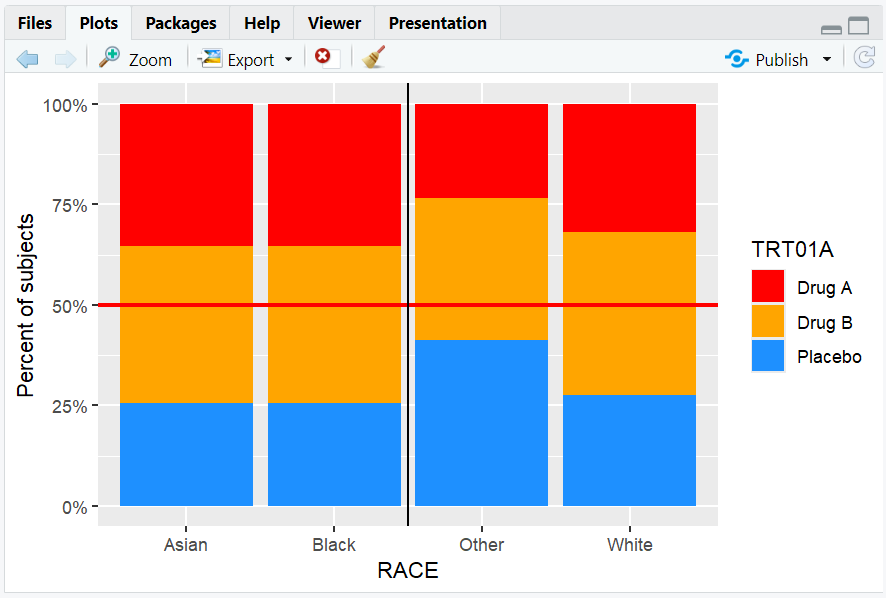
A barplot with a horizontal line at 50% and a vertical line between the 2nd and 3rd race categories.
5. Input and Output Table for Line Examples
| R Code Example | Input Data | Output (Plot/Description) |
|---|---|---|
geom_hline(yintercept = 0.5) |
adsl | Horizontal line at 50% |
geom_vline(xintercept = 2.5) |
adsl | Vertical line between categories |
| Both lines together | adsl | Barplot with both reference lines |
6. Exploring Beyond Basic Reference Lines
- Use
geom_abline()to add lines with a specified slope and intercept (e.g., y = x). - Add multiple lines for multiple thresholds.
- Combine with annotations for more context.
- Adjust line type (
linetype), color, and thickness for emphasis.
R Code Example:
ggplot(adsl, aes(x = AGE, y = ..count..)) +
  geom_histogram(binwidth = 5, fill = "skyblue") +
  geom_abline(slope = 1, intercept = 0, color = "blue", linetype = "dashed")

- Adds a dashed blue line with a specified slope and intercept.
7. Practice Problems
- Add a horizontal line at the mean AGE to a boxplot.
- Add a vertical line at AGE = 60 to a histogram.
- Add both a horizontal and vertical line to a barplot of RACE.
- Change the color and thickness of a reference line.
- Annotate a reference line with a label.
8. Further Reading and Resources
- ggplot2 documentation: geom_hline()
- ggplot2 documentation: geom_vline()
- R Graph Gallery: Reference Lines
- R for Data Science: Data Visualization
- Fundamentals of Data Visualization
**Resource download links**
2.6.14.-Vertical-and-Horizontal-Lines-in-ggplot2.zip
⁂