2.6.15. Introductions to Tables in R
1. Introduction
Tables are a fundamental way to summarize and present data. While visualizations are great for showing patterns and trends, tables are often the best way to display exact values, summary statistics, or breakdowns by group. In R, you can create both simple and highly formatted tables for exploration and reporting.
# Dummy ADSL data for ready-to-run examples
set.seed(123)
adsl <- data.frame(
  USUBJID = sprintf("SUBJ%03d", 1:200),
  AGE = round(rnorm(200, mean = 50, sd = 10)),
  SEX = sample(c("M", "F"), 200, replace = TRUE),
  RACE = sample(c("White", "Black", "Asian", "Other"), 200, replace = TRUE),
  TRT01A = sample(c("Placebo", "Drug A", "Drug B"), 200, replace = TRUE)
)
2. Why Use Tables?
- Display Summary Statistics: Tables are ideal for showing means, counts, percentages, and other summary statistics in a clear, precise way.
- Enable Value Lookup: Unlike plots, tables allow readers to find exact values quickly.
- Support Both Exploration and Reporting: Use tables for quick data checks during analysis and for polished presentation in reports.
- Flexible Formatting: Tables can be formatted for clarity, readability, and to match publication or organizational standards.
3. Good Table Practices
- Limit Digits: Too many decimal places can make tables hard to read. Round numbers to a sensible number of digits.
- Clear Captions: Always include a descriptive caption or title so readers know what the table shows.
- Simplicity: Avoid clutter. Only include columns and rows that are necessary for your message.
- Informative Headers: Use column names that are clear and self-explanatory.
- Source and Footnotes: Add a source or footnotes for context, especially in explanatory tables.
4. Creating Summary Tables in R
We'll use a dummy clinical ADSL dataset to demonstrate table creation and formatting. This dataset contains subject-level information such as age, sex, race, and treatment group.
Step 1: Summarize the Data
R Code:
library(dplyr)

# Summarize AGE by treatment group
df <- adsl %>%
  group_by(TRT01A) %>%
  dplyr::summarize(
    N = n(),
    min = min(AGE),
    avg = mean(AGE),
    max = max(AGE)
  )
df
Explanation:
group_by(TRT01A): Groups the data by treatment group.summarize(): Calculates the number of subjects (N), minimum age (min), average age (avg), and maximum age (max) for each treatment group.
Expected Outcome:
- A summary table showing the number of subjects, minimum, average, and maximum age by treatment group.
# A tibble: 3 × 5
  TRT01A      N   min   avg   max
  <chr>   <int> <dbl> <dbl> <dbl>
1 Drug A     63    34  49.9    71
2 Drug B     77    33  50.5    82
3 Placebo    60    27  49.2    72
5. Improving Table Appearance with knitr::kable
- The
knitr::kable()function creates simple, readable tables in R Markdown or HTML output. - You can limit the number of digits for summary statistics for clarity.
R Code:
library(knitr)
kable(df, digits = 0)
- Explanation:
digits = 0rounds all numeric columns to whole numbers for easier reading.
Expected Outcome:
A clean, basic table suitable for reports or quick checks.
|TRT01A  |  N| min| avg| max|
|:-------|--:|---:|---:|---:|
|Drug A  | 63|  34|  50|  71|
|Drug B  | 77|  33|  51|  82|
|Placebo | 60|  27|  49|  72|
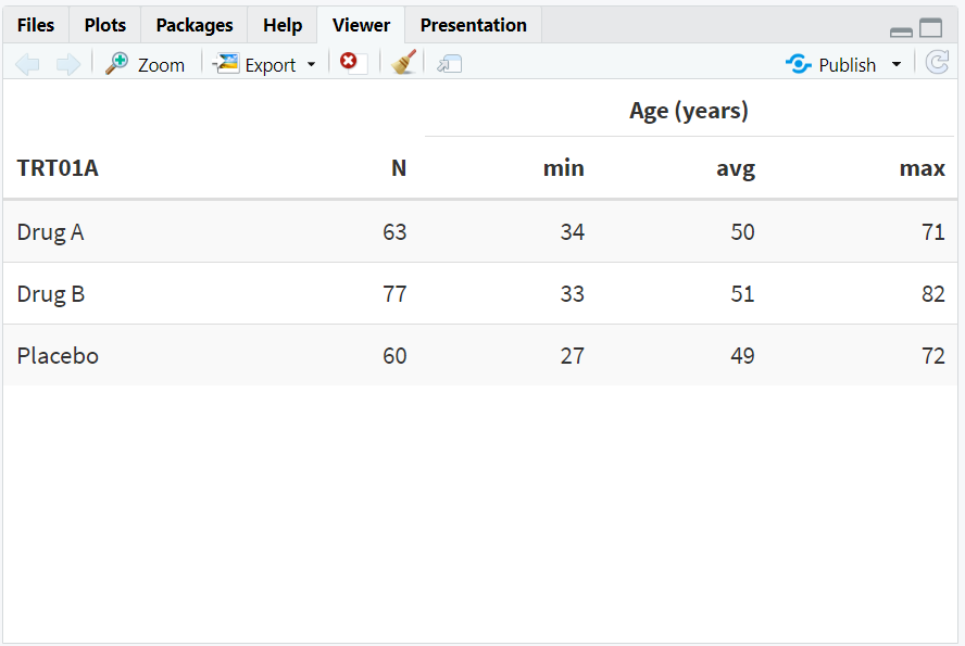
6. Advanced Table Formatting with kableExtra
- The
kableExtrapackage allows for advanced formatting: striped rows, borders, grouped headers, captions, and footnotes. - This improves readability and makes tables more visually appealing.
R Code:
library(kableExtra)
kable(df, digits = 0, "html") %>%
  kable_styling("striped", "bordered") %>%
  add_header_above(c(" " = 2, "Age (years)" = 3))
- Explanation:
kable_styling("striped", "bordered"): Adds alternating row shading and borders.add_header_above(): Adds a grouped header above the age columns.
Expected Outcome:
A formatted HTML table with grouped headers and alternating row colors.
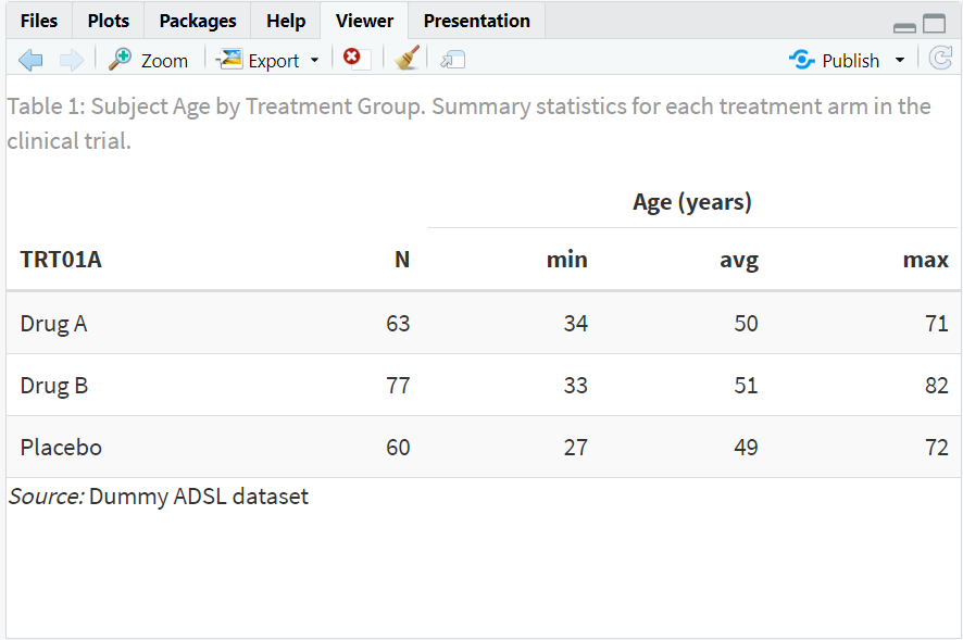
7. Adding Captions and Footnotes
- Captions provide context for the table.
- Footnotes can be used to cite data sources or add clarifying notes.
R Code:
kable(df, digits = 0, "html",
      caption = "Table 1: Subject Age by Treatment Group. Summary statistics for each treatment arm in the clinical trial.") %>%
  kable_styling("striped", "bordered") %>%
  add_header_above(c(" " = 2, "Age (years)" = 3)) %>%
  footnote(general = "Dummy ADSL dataset", general_title = "Source:", footnote_as_chunk = TRUE)
- Explanation:
caption: Adds a descriptive title above the table.footnote: Adds a source note at the bottom.
Expected Outcome:
A polished, publication-ready table with a caption and source.
8. Exploring Beyond Basic Tables
- Use packages like
formattable,gt, orflextablefor even more advanced tables. - Add conditional formatting (e.g., color cells based on value).
- Merge cells, add grouped headers, or highlight specific rows/columns.
- Export tables to Word, PDF, or HTML for sharing and reporting.
- Use interactive tables with the
DTpackage for web apps.
9. Practice Problems
- Create a summary table of average AGE by SEX.
- Format a table with striped rows and a caption.
- Add a footnote to a table showing the data source.
- Limit the number of digits in a summary table.
- Use
kableExtrato add a grouped header to a table.
10. Further Reading and Resources
- knitr::kable documentation
- kableExtra documentation
- R Graph Gallery: Tables
- R for Data Science: Communicate Results
- Fundamentals of Data Visualization
**Resource download links**
2.6.15.-Introductions-to-Tables-in-R.zip