2.6.16. ggrepel in R
1. Introduction
The ggrepel package provides geoms for ggplot2 that repel overlapping text labels, making your plots more readable and professional. It is especially useful when labeling points in scatterplots, where labels often overlap and become unreadable.
# Create a dummy ADAM dataset (ADLB - Laboratory Results Analysis Dataset)
set.seed(123)
# Subject-level dataset
adsl <- data.frame(
  USUBJID = sprintf("SUBJ%03d", 1:50),
  AGE = round(rnorm(50, mean = 50, sd = 15)),
  SEX = sample(c("M", "F"), 50, replace = TRUE),
  TRT01A = sample(c("Placebo", "Low Dose", "High Dose"), 50, replace = TRUE, prob = c(0.3, 0.3, 0.4))
)

# Laboratory dataset with multiple records per subject
adlb <- data.frame(
  USUBJID = rep(adsl$USUBJID, each = 2),
  PARAMCD = rep(c("ALT", "AST"), times = 50),
  AVAL = c(rnorm(50, 30, 15), rnorm(50, 35, 12)),  # ALT and AST values
  BASE = c(rnorm(50, 28, 10), rnorm(50, 32, 8))    # Baseline values
)

# Merge to get treatment for each lab value
adlb <- merge(adlb, adsl[, c("USUBJID", "TRT01A", "AGE")], by = "USUBJID")
2. Why Use ggrepel?
- Prevents text labels from overlapping in ggplot2 plots.
- Automatically adjusts label positions for clarity.
- Makes plots with many labels much more readable.
- Supports advanced customization for highlighting and formatting.
3. Basic Usage: Avoiding Overlapping Labels
Let's use our clinical datasets to create a scatterplot showing the relationship between baseline values and actual values for ALT measurements, with subject IDs as labels.
R Code:
library(ggplot2)
library(dplyr)

# Filter for just ALT measurements
alt_data <- adlb %>% filter(PARAMCD == "ALT")

# Plot without ggrepel - notice overlapping labels
ggplot(alt_data, aes(BASE, AVAL, label = USUBJID)) +
  geom_text() +
  geom_point(color = 'dodgerblue') +
  labs(x = "Baseline ALT", y = "ALT Value") +
  theme_classic()
Expected Outcome:
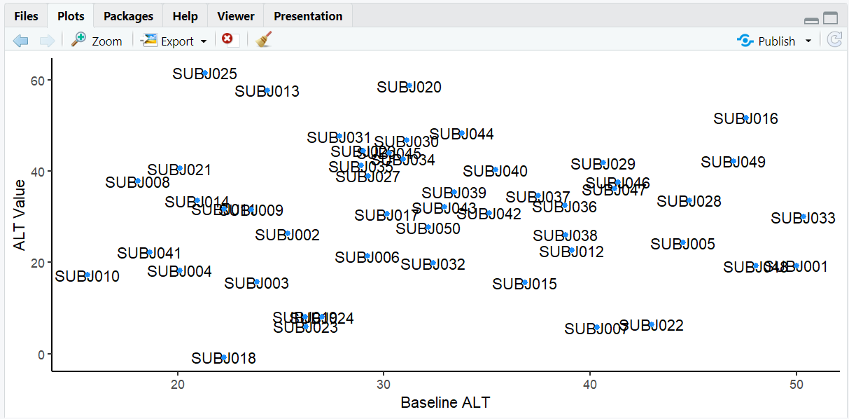
A scatterplot showing baseline vs. actual ALT values with overlapping subject ID labels, making it hard to read.
4. Using ggrepel for Clear Labels
R Code:
# install.packages("ggrepel")
library(ggrepel)

# Plot with ggrepel - labels are now readable
ggplot(alt_data, aes(BASE, AVAL, label = USUBJID)) +
  geom_text_repel() +
  geom_point(color = 'dodgerblue') +
  labs(x = "Baseline ALT", y = "ALT Value") +
  theme_classic()
Expected Outcome:
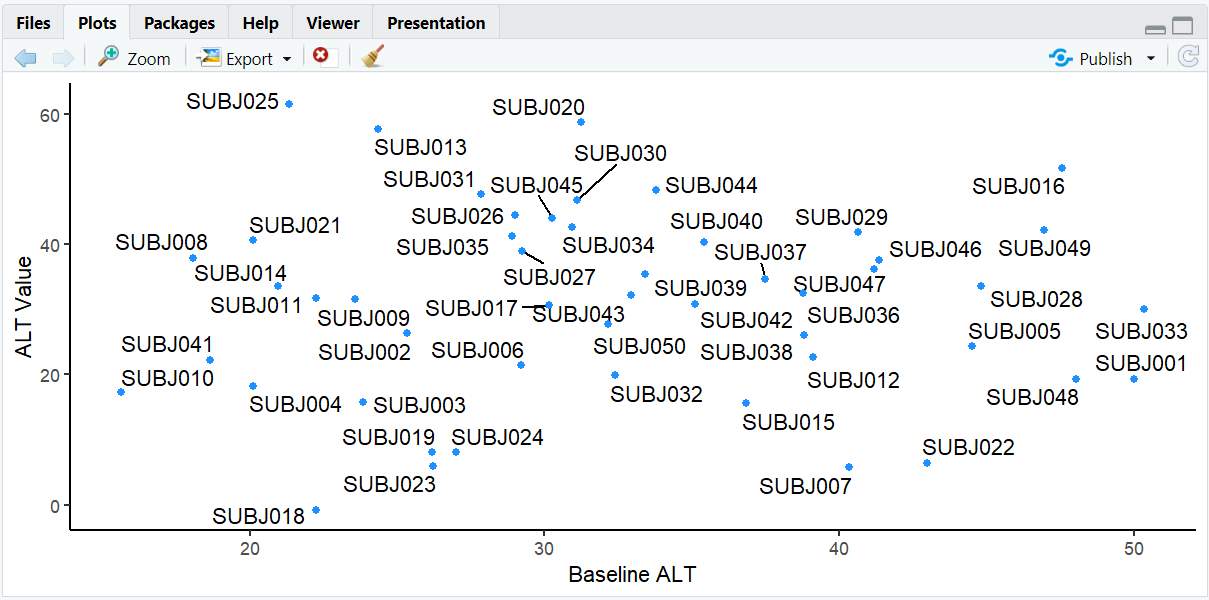
The same scatterplot but now with labels that are automatically positioned to avoid overlap, making all subject IDs readable.
5. Highlighting Specific Points
Often, you don't want to label all subjects but instead highlight a specific treatment group of interest.
R Code:
# Create indicator for High Dose subjects
alt_data <- alt_data %>%
  mutate(is_high_dose = TRT01A == "High Dose")

# Plot with only High Dose subjects labeled
ggplot(alt_data, aes(BASE, AVAL, label = USUBJID)) +
  geom_point(aes(color = is_high_dose)) +
  scale_color_manual(values = c("grey50", "dodgerblue"),
                     name = "Treatment",
                     labels = c("Other", "High Dose")) +
  geom_text_repel(data = filter(alt_data, is_high_dose == TRUE)) +
  labs(x = "Baseline ALT", y = "ALT Value") +
  theme_classic()
Expected Outcome:
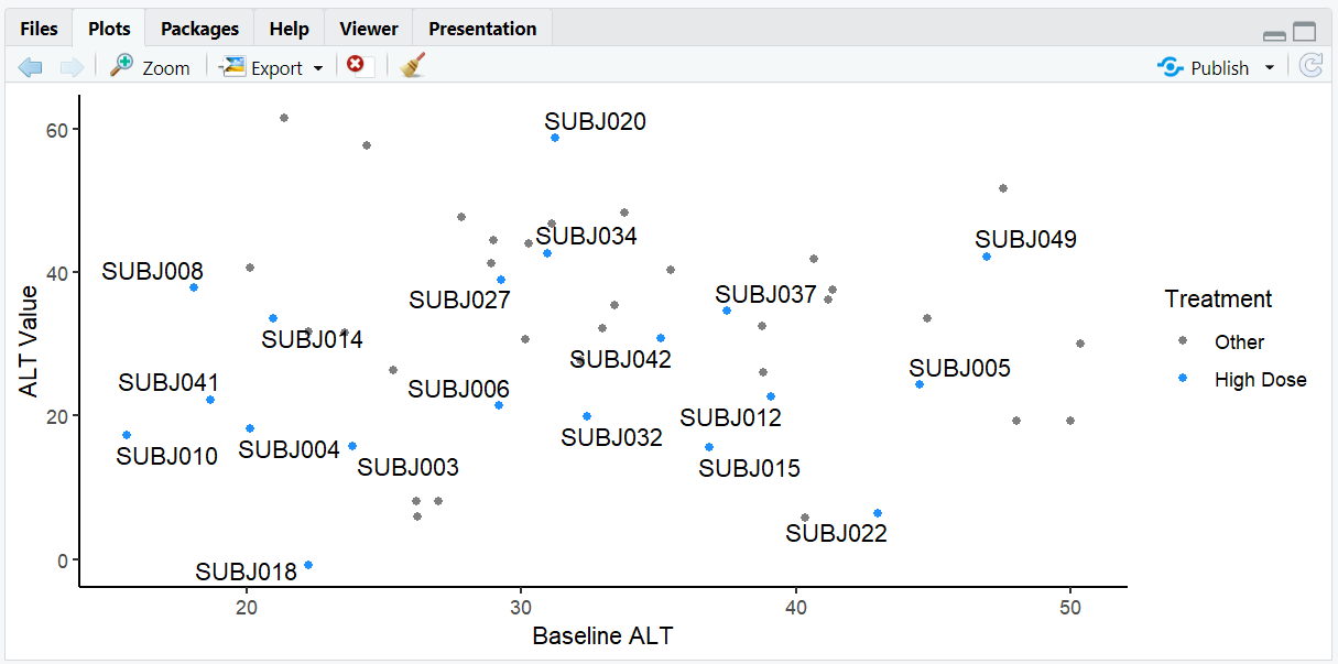
A scatterplot where only subjects in the High Dose group are labeled, making it easy to focus on this treatment arm. High Dose points are colored blue while other points are gray.
6. Customizing Label Alignment and Position
Let's explore how to control label positioning by examining elderly subjects (age > 65) in our dataset.
R Code:
# Identify elderly subjects and plot with customized labels
alt_data %>%
  mutate(elderly = ifelse(AGE > 65, "Elderly", "Adult")) %>%
  ggplot(aes(BASE, AVAL, label = USUBJID)) +
    geom_point(aes(color = elderly)) +
    scale_color_manual(values = c("dodgerblue", "red")) +
    theme_minimal() +
    labs(x = "Baseline ALT", y = "ALT Value") +
    geom_text_repel(
      data = . %>% filter(AGE > 65),
      nudge_y = 5,
      hjust = 0.5,
      direction = "x",
      segment.color = "gray60",
      box.padding = 0.5
    )
Expected Outcome:
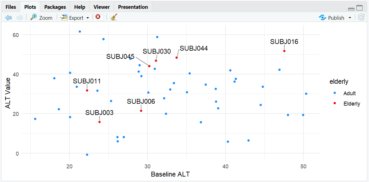
A scatterplot where only elderly subjects (AGE > 65) are labeled. Labels are aligned horizontally (direction = "x") and nudged upward from the points (nudge_y = 5) for clarity.
7. Input and Output Table for ggrepel Examples
| R Code Example | Input Data | Output (Plot/Description) |
|---|---|---|
geom_text() |
adlb (ALT) | Overlapping subject ID labels |
geom_text_repel() |
adlb (ALT) | Repelled, readable labels |
| Label High Dose only | adlb (ALT) | Only High Dose subjects labeled |
| Label elderly subjects | adlb (ALT) | Only elderly subjects labeled with customized alignment |
8. Exploring Beyond Basic ggrepel
- Use
geom_label_repel()for labels with backgrounds, useful for highlighting important outliers. - Adjust
box.padding,point.padding, andsegment.sizefor fine control. - Combine with facets to compare labeling across different parameters or visits.
- Use
min.segment.lengthto control when connecting lines appear.
R Code Example:
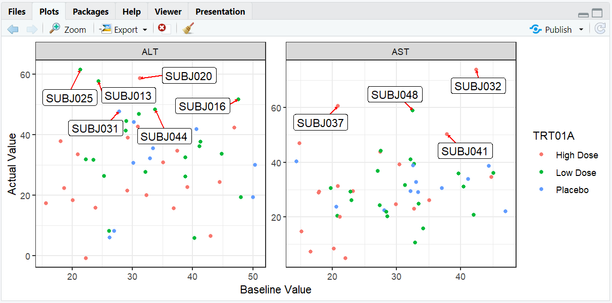
# Compare ALT and AST values with faceting and background labels
ggplot(adlb, aes(BASE, AVAL, label = USUBJID)) +
  geom_point(aes(color = TRT01A)) +
  facet_wrap(~PARAMCD, scales = "free") +
  geom_label_repel(
    data = adlb %>% filter(AVAL > quantile(adlb$AVAL, 0.9)),
    box.padding = 0.5,
    segment.color = "red",
    segment.size = 0.5,
    arrow = arrow(length = unit(0.01, "npc"))
  ) +
  labs(x = "Baseline Value", y = "Actual Value") +
  theme_bw()
9. Practice Problems
- Label only subjects with ALT values > 50 in a scatterplot.
- Use
geom_label_repel()to add background to labels for female subjects. - Change the color and size of label segments based on treatment group.
- Create a plot with different nudge directions for different treatment groups.
- Combine ggrepel with faceting by sex.
10. Further Reading and Resources
- ggrepel documentation
- ggrepel vignettes
- R Graph Gallery: ggrepel
- R for Data Science: Data Visualization