2.6.6. Geoms in ggplot2
1. Introduction
A "geom" in ggplot2 is the geometric object that represents your data in a plot. Each plot type uses a different geom, such as points, bars, or boxes. Understanding geoms is key to creating a wide variety of visualizations in R, including for clinical datasets such as SDTM or ADaM.
2. What is a Geom?
- A geom is the shape or object used to represent data in a plot.
- Examples: points (scatterplots), bars (barplots), rectangles (histograms), boxes (boxplots).
- You choose the geom by adding a layer like
geom_point(),geom_bar(), orgeom_boxplot()to your ggplot2 code.
3. Histograms: geom_histogram
- Purpose: Visualize the distribution and shape of a single numeric variable (e.g., AGE or HEIGHT in a clinical dataset).
- When to use: To see the range, center, and spread of your data.
R Code:
library(ggplot2)
# Example SDTM/ADaM-like dataset
adam <- data.frame(
  USUBJID = paste0("SUBJ", 1:100),
  AGE = sample(18:80, 100, replace = TRUE),
  HEIGHT = round(rnorm(100, mean = 165, sd = 10), 1),
  WEIGHT = round(rnorm(100, mean = 70, sd = 12), 1),
  SEX = sample(c("M", "F"), 100, replace = TRUE),
  TRT = sample(c("Placebo", "Active"), 100, replace = TRUE)
)
ggplot(data = adam) +
  geom_histogram(mapping = aes(AGE), bins = 15)
- By default, uses 30 bins. Here, bins are set to 15 for clarity.
Expected Outcome:

A histogram showing the age distribution of subjects in the clinical dataset.
4. Barplots: geom_bar
- Purpose: Show counts for each category of a categorical variable (e.g., treatment arm or sex).
- When to use: To compare the size of groups.
R Code:
ggplot(data = adam) +
  geom_bar(mapping = aes(TRT))
Expected Outcome:
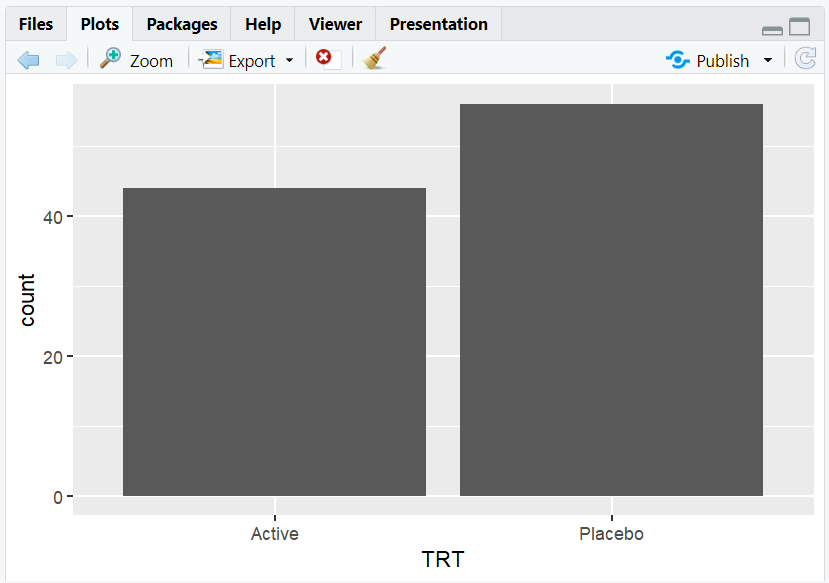
A barplot showing the number of subjects in each treatment arm.
5. Boxplots: geom_boxplot
- Purpose: Summarize the distribution of a numeric variable by category (e.g., weight by treatment arm).
- When to use: To compare medians, ranges, and outliers between groups.
R Code:
ggplot(data = adam) +
  geom_boxplot(mapping = aes(x = TRT, y = WEIGHT))
Expected Outcome:
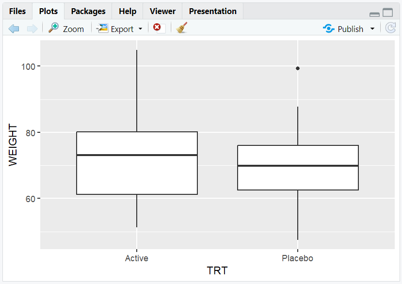
A boxplot showing the weight distribution for each treatment arm.
6. Customizing Geoms
- You can change the appearance of geoms by adding arguments inside or outside
aes(). - For example, change the fill color of all boxes in a boxplot:
R Code:
ggplot(data = adam) +
  geom_boxplot(mapping = aes(x = TRT, y = WEIGHT), fill = "lightblue")
Expected Outcome:

A boxplot with all boxes filled in light blue.
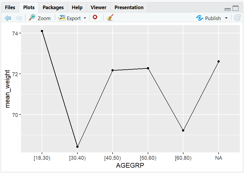
7. Exploring Other Geoms
- ggplot2 supports many geoms:
geom_line(),geom_violin(),geom_density(),geom_area(),geom_jitter(),geom_smooth(), and more. - For example, a line plot of mean weight by age group:
R Code:
library(dplyr)
adam$AGEGRP <- cut(adam$AGE, breaks = c(18,30,40,50,60,80), right = FALSE)
mean_weight <- adam %>%
  group_by(AGEGRP) %>%
  summarise(mean_weight = mean(WEIGHT, na.rm = TRUE))
ggplot(mean_weight, aes(x = AGEGRP, y = mean_weight, group = 1)) +
  geom_line() +
  geom_point()
8. Input and Output Table for Geoms
| Geom Function | Input Data | Output (Plot/Description) |
|---|---|---|
geom_histogram() |
adam | Histogram of AGE |
geom_bar() |
adam | Barplot of TRT |
geom_boxplot() |
adam | Boxplot of WEIGHT by TRT |
geom_line() |
mean_weight | Line plot of mean weight by agegrp |
9. Exploring Beyond Basic Geoms
- Combine multiple geoms in one plot (e.g., points and smooth lines).
- Use
facet_wrap()to split plots by category (e.g., by SEX). - Customize geoms with color, size, linetype, and more.
- Explore advanced geoms in the ggplot2 documentation.
10. Practice Problems
- Create a histogram of subject height.
- Make a barplot of subject sex.
- Draw a boxplot of weight by sex.
- Change the fill color of a boxplot.
- Combine a scatterplot and a smooth line for age vs. weight.
11. Further Reading and Resources
**Resource download links**
⁂