2.6.7. Colors in ggplot2
1. Introduction
Color is a powerful tool in data visualization. In ggplot2, you can use color to highlight patterns, distinguish groups, and make your plots more engaging and informative. This section covers how to use and customize color in your ggplot2 plots.
2. Using Color in ggplot2
- Color can be mapped to a variable (inside
aes()) or set manually (outsideaes()). - Mapping color to a variable adds a legend and helps distinguish groups.
- Use
colorfor outlines/points andfillfor filled areas (bars, boxes).
3. Color in Scatterplots
R Code:
library(ggplot2)
adam <- data.frame(
  USUBJID = paste0("SUBJ", 1:100),
  AGE = sample(18:80, 100, replace = TRUE),
  HEIGHT = round(rnorm(100, mean = 165, sd = 10), 1),
  WEIGHT = round(rnorm(100, mean = 70, sd = 12), 1),
  SEX = sample(c("M", "F"), 100, replace = TRUE),
  TRT = sample(c("Placebo", "Active"), 100, replace = TRUE)
)
ggplot(adam) +
  geom_point(aes(x = AGE, y = WEIGHT, color = SEX))
- Description:
- Points are colored by subject sex.
- A legend is added automatically.
Expected Outcome:

A scatterplot with points colored by sex.
4. Color in Barplots
R Code:
ggplot(adam) +
  geom_bar(aes(x = TRT))
- Description:
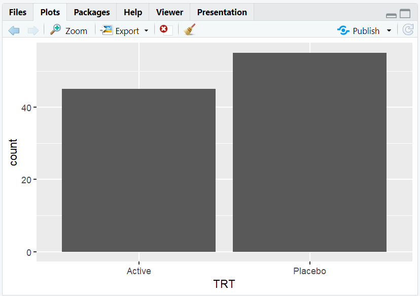
- Barplot of subject counts by treatment arm.
- All bars are the same color by default.
R Code:
ggplot(adam) +
  geom_bar(aes(x = TRT, color = TRT))
- Description:

- Colors the outline of each bar by treatment arm.
R Code:
ggplot(adam) +
  geom_bar(aes(x = TRT, fill = TRT))
- Description:
- Fills each bar with a different color for each treatment arm.
Expected Outcome:
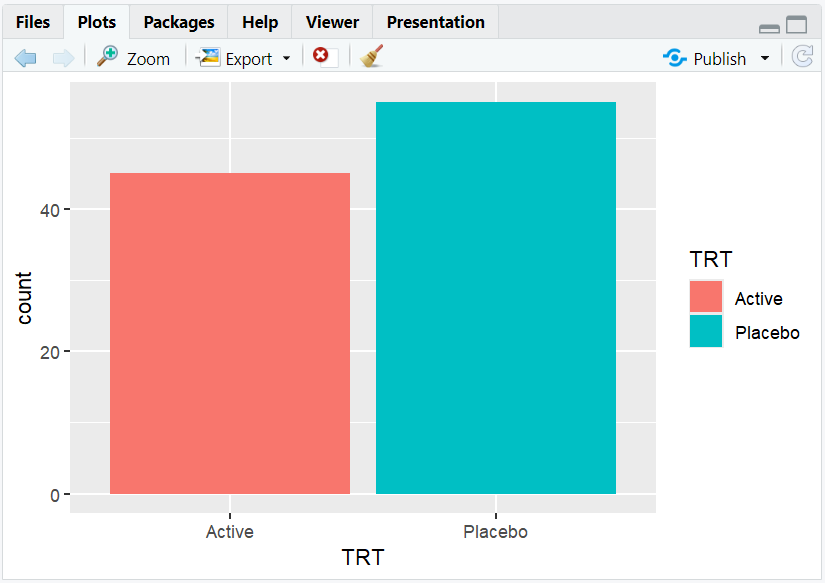
A barplot with bars filled by treatment arm, making group differences clear.
5. Mapping a Different Variable to Fill
R Code:
ggplot(adam) +
  geom_bar(aes(x = TRT, fill = SEX))
- Description:
- Stacked barplot showing the breakdown of sex within each treatment arm.
Expected Outcome:
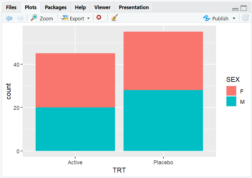
A stacked barplot with each segment colored by sex.
6. Manually Setting Colors
- Use
scale_fill_manual()to set custom colors for fills. - Use
scale_color_manual()to set custom colors for outlines/points.
R Code:
ggplot(adam) +
  geom_bar(aes(x = TRT, fill = SEX)) +
  scale_fill_manual(values = c("pink", "lightblue"))
- Description:
- Manually assigns colors to each sex group.
Expected Outcome:
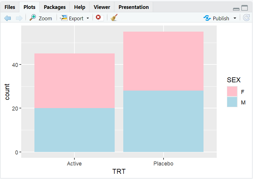
A barplot with custom colors for each sex.
7. Position Adjustments with Color
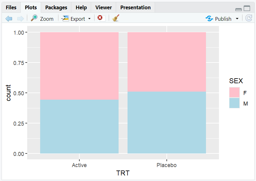
position = "fill": Bars are scaled to 100% height, showing proportions.position = "dodge": Bars for each group are placed side by side.
R Code:
# Proportion barplot
ggplot(adam) +
  geom_bar(aes(x = TRT, fill = SEX), position = "fill") +
  scale_fill_manual(values = c("pink", "lightblue"))
R Code:
# Grouped barplot
ggplot(adam) +
  geom_bar(aes(x = TRT, fill = SEX), position = "dodge") +
  scale_fill_manual(values = c("pink", "lightblue"))

- Description:
- "fill" allows comparison of proportions across groups.
- "dodge" allows comparison of values within each group.
8. Exploring Beyond Basic Colors
- Use color palettes from
RColorBrewer,viridis, orggscifor better accessibility and aesthetics. - Use
scale_fill_brewer()orscale_fill_viridis_d()for built-in palettes. - Adjust transparency with
alphafor overlapping points. - Explore colorblind-friendly palettes for accessibility.
R Code Example:
library(RColorBrewer)
ggplot(adam) +
  geom_bar(aes(x = TRT, fill = SEX)) +
  scale_fill_brewer(palette = "Set2")

9. Input and Output Table for Color Examples
| R Code Example | Input Data | Output (Plot/Description) |
|---|---|---|
color = SEX |
adam | Scatterplot, color by sex |
fill = TRT |
adam | Barplot, fill by treatment arm |
fill = SEX + manual colors |
adam | Barplot, custom colors by sex |
position = "fill" |
adam | Proportion barplot |
10. Practice Problems
- Create a barplot of subject sex, filled by treatment arm.
- Make a scatterplot of weight vs. age, colored by sex.
- Use a colorblind-friendly palette for a barplot.
- Adjust the transparency of points in a scatterplot.
- Manually set the colors for a grouped barplot.
11. Further Reading and Resources
- ggplot2 documentation: Colors
- RColorBrewer palettes
- R Graph Gallery: Colors
- Datawrapper Blog: Color in Data Viz
- Fundamentals of Data Visualization
**Resource download links**
⁂