2.6.8. Labels in ggplot2
1. Introduction
Labels are essential for making your plots clear and informative. Good labels help viewers understand what is being shown, highlight key messages, and make your visualizations more effective. In ggplot2, you can add and customize titles, axis labels, subtitles, captions, and annotations.
2. Why Labels Matter
- Titles summarize the main message of the plot.
- Axis labels tell viewers what each axis represents (including units).
- Subtitles and captions provide context or additional information.
- Annotations can highlight important data points or trends.
- Clear labeling improves accessibility and interpretation.
3. Adding Titles, Subtitles, and Captions
- Use the
labs()function to add a title, subtitle, and caption to your plot. - Each argument in
labs()(title, subtitle, caption, x, y) controls a different label.
R Code:
library(ggplot2)
adam <- data.frame(
  USUBJID = paste0("SUBJ", 1:100),
  AGE = sample(18:80, 100, replace = TRUE),
  HEIGHT = round(rnorm(100, mean = 165, sd = 10), 1),
  WEIGHT = round(rnorm(100, mean = 70, sd = 12), 1),
  SEX = sample(c("M", "F"), 100, replace = TRUE),
  TRT = sample(c("Placebo", "Active"), 100, replace = TRUE)
)
ggplot(adam) +
  geom_bar(aes(x = TRT, fill = SEX), position = "fill") +
  scale_fill_manual(values = c("pink", "lightblue")) +
  labs(
    title = "Treatment Arm Distribution by Sex",
    subtitle = "Proportion of subjects by treatment and sex",
    caption = "Source: Simulated ADaM dataset"
  )
Expected Outcome:
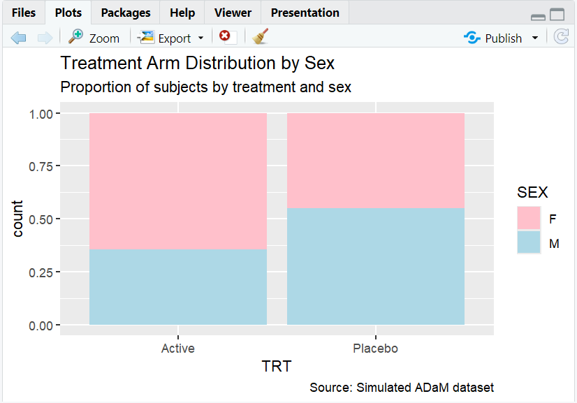
A proportion barplot with a clear title, subtitle, and caption.
4. Customizing Axis Labels
- Use
xlab()andylab()to set axis labels directly. - Or, use
labs(x = "...", y = "...")inside thelabs()function.
R Code:
ggplot(adam) +
  geom_bar(aes(x = TRT, fill = SEX), position = "fill") +
  scale_fill_manual(values = c("pink", "lightblue")) +
  labs(
    title = "Treatment Arm Distribution by Sex",
    subtitle = "Proportion of subjects by treatment and sex"
  ) +
  ylab("Proportion")
Expected Outcome:

A barplot with the y-axis labeled as "Proportion" (instead of the default "count").
5. Annotating Plots
- Use
annotate(),geom_text(), orgeom_label()to add text directly to the plot area. - Useful for highlighting specific points or adding explanations.
R Code Example:
ggplot(adam, aes(x = AGE, y = WEIGHT)) +
  geom_point(alpha = 0.3) +
  labs(title = "Subject Weight vs. Age") +
  annotate("text", x = 75, y = max(adam$WEIGHT), label = "Oldest subject", color = "red")
Expected Outcome:
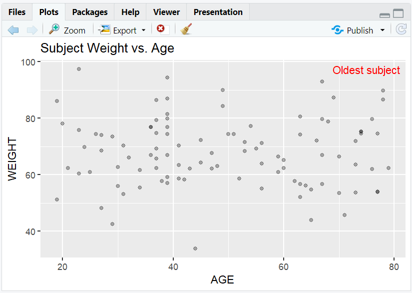
A scatterplot with a red annotation pointing out the oldest subject.
6. Input and Output Table for Label Examples
| R Code Example | Input Data | Output (Plot/Description) |
|---|---|---|
labs(title=...) |
adam | Plot with a title |
labs(subtitle=...) |
adam | Plot with a subtitle |
ylab("Proportion") |
adam | Y-axis labeled "Proportion" |
annotate() |
adam | Plot with custom annotation |
7. Exploring Beyond Basic Labels
- Use
theme()to adjust label size, font, and position. - Add mathematical notation with
expression(). - Use
guides()andscale_*_discrete()to customize legend titles and labels. - Combine multiple labels for multi-layered explanations.
R Code Example:
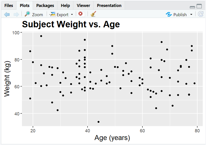
ggplot(adam, aes(x = AGE, y = WEIGHT)) +
  geom_point() +
  labs(title = "Subject Weight vs. Age", x = "Age (years)", y = "Weight (kg)") +
  theme(
    plot.title = element_text(size = 18, face = "bold"),
    axis.title = element_text(size = 14)
  )
8. Practice Problems
- Add a title, subtitle, and caption to a barplot of subject sex.
- Change the x- and y-axis labels of a scatterplot of weight vs. age.
- Annotate the subject with the highest weight in a scatterplot.
- Make axis labels larger using
theme(). - Add a legend title for fill in a barplot.
9. Further Reading and Resources
**Resource download links**
⁂