3.1.3. User Interface (UI) Basics
1. Executive Summary
Building effective Shiny applications begins with understanding how to structure and organize user interfaces that are both functional and aesthetically pleasing. This comprehensive chapter explores the fundamental building blocks of Shiny UI design, from basic layout functions to advanced accessibility considerations.
2. Why Shiny UI Matters
The mental model for Shiny UI follows a hierarchical structure: layout → panels/containers → components → text/graphics/help. This systematic approach ensures logical organization and maintainable code.
Performance and UX Considerations: Well-structured UI impacts render time through minimal DOM manipulation, effective reactive isolation, and optimized component selection. Poor UI structure can lead to unnecessary re-renders and sluggish user interactions. Key performance factors include reducing deep nesting, using conditionalPanel judiciously, and implementing proper reactive boundaries.

Bootstrap 12-column grid system demonstration with multiple row layouts
3. Layout Functions
3.1 fluidPage
Concept: fluidPage creates responsive, Bootstrap-powered layouts that automatically adapt to different screen sizes using the 12-column grid system. This layout is ideal for modern applications that need to work across devices.
When to use: Dashboard applications, public-facing tools, analytics platforms, and any application requiring responsive behavior across desktop, tablet, and mobile devices.
Minimal Example:
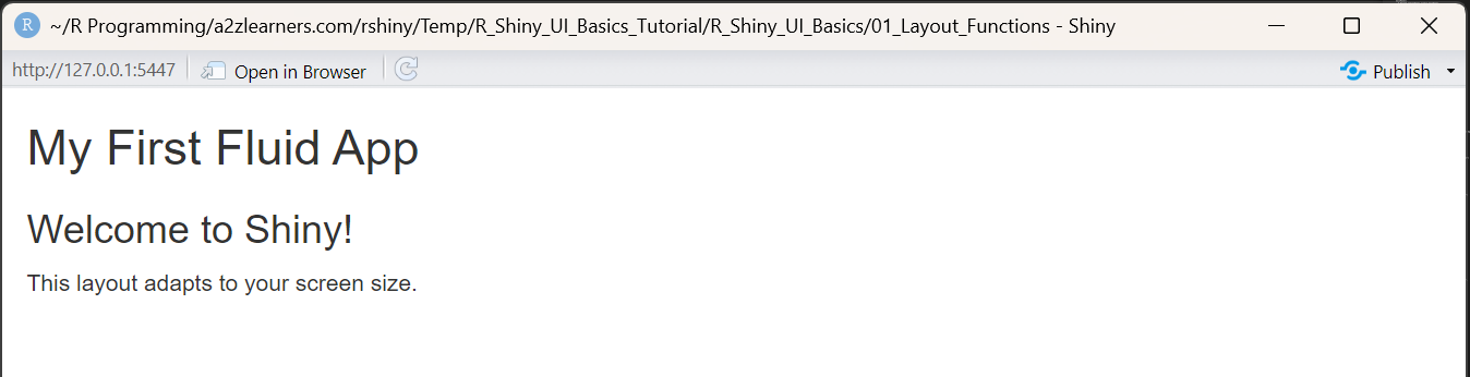
- Demonstrates a basic Shiny app layout using
fluidPage. - Shows how to add a title, header, and paragraph.
- The UI automatically adapts to different screen sizes.
library(shiny)
library(bslib)

# Basic fluidPage structure
ui <- fluidPage(
  titlePanel("My First Fluid App"),

  # Simple content
  h3("Welcome to Shiny!"),
  p("This layout adapts to your screen size.")
)

server <- function(input, output, session) {
  # Empty server for this example
}

shinyApp(ui, server)
Advanced Example with Grid System and Theming - P1:
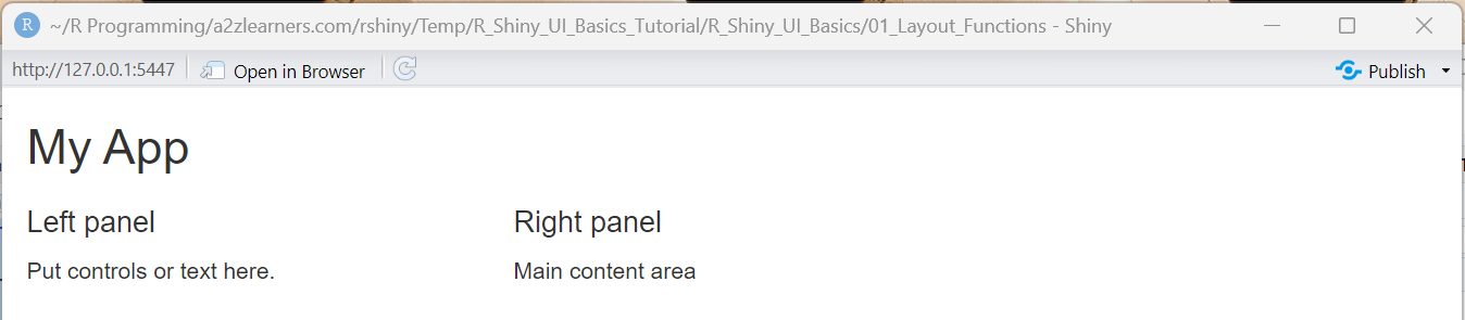
- Shows use of
fluidRowandcolumnfor grid-based layout. - Illustrates splitting the UI into left and right panels.
- Useful for organizing controls and main content side by side.
library(shiny)

ui <- fluidPage(                           # Responsive page container
  titlePanel("My App"),                    # Title bar
  fluidRow(                                # A horizontal row
    column(width = 4,                      # 4/12 width column
           h4("Left panel"),                    # Any UI elements go here
           p("Put controls or text here.")      # Paragraph text
    ),
    column(width = 8,                      # 8/12 width column
           h4("Right panel"),
           div(class = "p-3 border rounded",    # Styled content block
               "Main content area")
    )
  )
)

server <- function(input, output, session) { }

shinyApp(ui, server)
Advanced Example with Grid System and Theming - P2:
- Demonstrates custom theming with
bslib::bs_theme. - Uses Bootstrap utility classes for styling and layout.
- Shows how to organize content with tabs and cards for a modern UI.
library(shiny)
library(bslib)

# Choose a theme: Bootswatch preset + custom tweaks
app_theme <- bs_theme(
  version = 5,
  bootswatch = "minty",          # try "flatly", "darkly", etc.
  primary = "#0d6efd",
  bg = "#ffffff", fg = "#212529",
  base_font = font_google("Inter"),
  heading_font = font_google("Inter"),
  "font-size-base" = "1.05rem"   # Sass variable override
)

ui <- fluidPage(
  theme = app_theme,
  titlePanel("Tabs + Theme + Style"),

  # Custom CSS to style tab headers (selected/unselected)
  tags$style(HTML("
    /* Unselected tabs */
    .tabbable > .nav > li > a {
      background-color: #e9ecef; color: #495057;
    }
    /* Active tab */
    .tabbable > .nav > li.active > a,
    .tabbable > .nav > li > a.active {
      background-color: #0d6efd; color: #fff;
    }
  ")),

  # Top row with Bootstrap 5 utility classes
  fluidRow(
    column(
      12,
      div(class = "p-3 mb-3 rounded bg-light border",
          "This row uses Bootstrap 5 utility classes for padding, spacing, and background.")
    )
  ),

  # Tabs for organizing content
  tabsetPanel(id = "tabs",
              tabPanel(
                "Overview",
                div(class = "p-3",
                    h4("Overview section"),
                    p("Place any UI elements here: text, inputs, or custom HTML blocks."))
              ),
              tabPanel(
                "Cards",
                fluidRow(
                  column(
                    4,
                    div(class = "card shadow-sm mb-3",
                        div(class = "card-header fw-bold", "Card A"),
                        div(class = "card-body",
                            p("Card with header and body."),
                            actionButton("a", "Primary", class = "btn btn-primary"),
                            tags$span(class = "badge bg-success ms-2", "New")))
                  ),
                  column(
                    4,
                    div(class = "card border-success mb-3",
                        div(class = "card-header text-success fw-bold", "Card B"),
                        div(class = "card-body",
                            p("Outlined success card."),
                            tags$div(class = "alert alert-warning mt-2",
                                     "Use alerts for highlights.")))
                  ),
                  column(
                    4,
                    div(class = "card mb-3",
                        div(class = "card-header fw-bold", "Card C"),
                        div(class = "card-body",
                            p("Apply spacing with p-*, m-*; colors with bg-*, text-*.")))
                  )
                )
              ),
              tabPanel(
                "Layout",
                fluidRow(
                  column(
                    3,
                    div(class = "text-center text-white bg-primary p-3 rounded", "Col 3")
                  ),
                  column(
                    3,
                    div(class = "text-center text-white bg-secondary p-3 rounded", "Col 3")
                  ),
                  column(
                    6,
                    div(class = "text-center text-white bg-success p-3 rounded", "Col 6")
                  )
                ),
                hr(),
                fluidRow(
                  column(
                    6,
                    div(class = "p-3 border rounded",
                        h5("Left 6"),
                        p("Grid uses 12 units per row; widths can vary per column."))
                  ),
                  column(
                    6,
                    div(class = "p-3 border rounded",
                        h5("Right 6"),
                        p("Add rows for complex layouts; tabs keep content organized."))
                  )
                )
              )
  )
)

server <- function(input, output, session) { }

shinyApp(ui, server)

3.2 fixedPage
Concept: fixedPage provides fixed-width containers (typically max 1170px) that center on larger screens while maintaining responsive behavior within the fixed bounds. This ensures consistent visual presentation across different devices.
When to use: Scientific applications, reports, documentation-style interfaces, or applications requiring predictable layout behavior.
Example with Typography Focus:
- Uses
fixedPagefor a centered, fixed-width layout. - Demonstrates consistent typography and article-like structure.
- Good for reports, documentation, or scientific apps.
library(shiny)
library(bslib)

ui <- fixedPage(
  theme = bs_theme(version = 5, bootswatch = "journal"),

  titlePanel("Research Article Layout"),

  # Article-like content with consistent typography
  fixedRow(
    column(width = 8, offset = 2,
      wellPanel(
        h1("Understanding Data Patterns"),
        p(class = "lead",
          "This fixed-width layout ensures optimal reading experience
           across different screen sizes."),

        h2("Methods"),
        p("Lorem ipsum dolor sit amet, consectetur adipiscing elit.
          Sed do eiusmod tempor incididunt ut labore et dolore magna aliqua."),

        h3("Statistical Analysis"),
        verbatimTextOutput("stats_output"),

        h2("Results"),
        plotOutput("result_plot", height = "400px"),

        h2("Conclusion"),
        p("The fixed layout provides consistent presentation while
          maintaining readability standards.")
      )
    )
  )
)

server <- function(input, output, session) {
  output$stats_output <- renderPrint({
    summary(mtcars[1:4])
  })

  output$result_plot <- renderPlot({
    ggplot(mtcars, aes(x = wt, y = mpg)) +
      geom_point(size = 3, alpha = 0.7) +
      geom_smooth(method = "lm", se = FALSE) +
      theme_minimal() +
      labs(title = "Weight vs MPG Relationship",
           x = "Weight (1000 lbs)",
           y = "Miles per Gallon")
  })
}

shinyApp(ui, server)
Trade-offs vs fluidPage: Fixed layout provides consistent visual hierarchy but sacrifices full-screen real estate on larger displays.

3.3 navbarPage
Concept: navbarPage creates multi-tab navigation within a single app session, providing website-like navigation experience. Unlike basic tabsetPanel, navbar offers full-page organization with each tab capable of having its own complex layouts.
navbarPage vs tabsetPanel: navbarPage is designed for application-level navigation where each tab represents a major section, while tabsetPanel is better for organizing related content within a single page section.
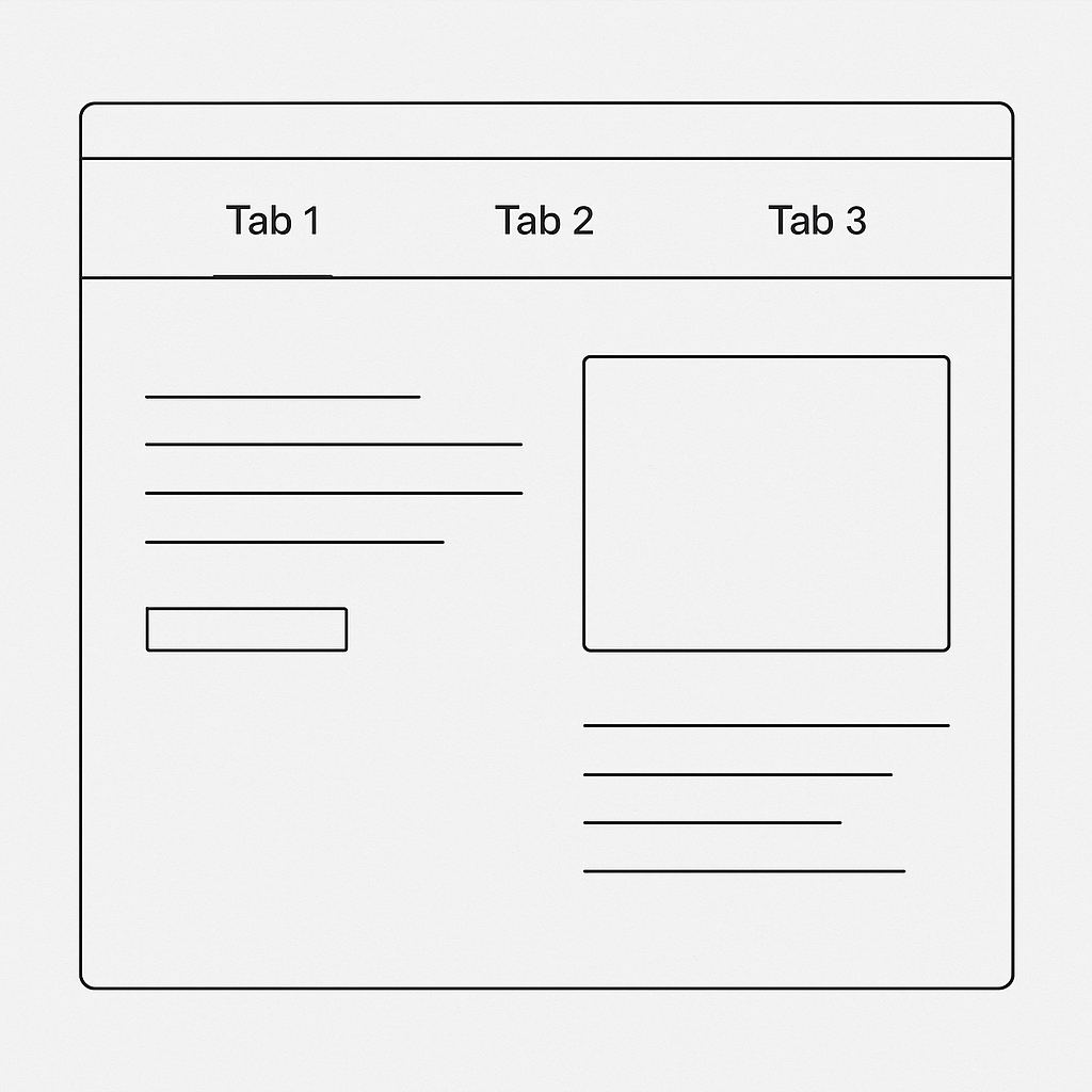
Navbar page wireframe with tabbed navigation structure
Example with Nested Navigation:
- Implements multi-tab navigation with
navbarPage. - Each tab can have its own layout and controls.
- Suitable for apps with multiple major sections.
library(shiny)
library(bslib)
library(DT)

ui <- navbarPage(
  title = "Analytics Dashboard",
  theme = bs_theme(version = 5, bootswatch = "flatly"),

  # First tab with complex layout
  tabPanel("Data Exploration",
    sidebarLayout(
      sidebarPanel(width = 3,
        selectInput("explore_dataset", "Dataset:",
                   choices = c("mtcars", "iris")),
        conditionalPanel(
          condition = "input.explore_dataset == 'mtcars'",
          selectInput("x_var", "X Variable:",
                     choices = names(mtcars))
        ),
        conditionalPanel(
          condition = "input.explore_dataset == 'iris'",
          selectInput("x_var_iris", "X Variable:",
                     choices = names(iris)[1:4])
        )
      ),
      mainPanel(width = 9,
        tabsetPanel(
          tabPanel("Visualization", plotOutput("explore_plot")),
          tabPanel("Data Table", DT::dataTableOutput("explore_table"))
        )
      )
    )
  ),

  # Nested navbar menu
  navbarMenu("Analysis",
    tabPanel("Statistical Summary",
      fluidRow(
        column(12,
          h2("Dataset Statistics"),
          verbatimTextOutput("stats_summary")
        )
      )
    ),
    tabPanel("Model Results",
      fluidRow(
        column(6,
          wellPanel(
            h4("Model Configuration"),
            selectInput("model_type", "Model:",
                       choices = c("Linear", "Polynomial")),
            actionButton("run_model", "Run Analysis",
                        class = "btn-primary")
          )
        ),
        column(6,
          conditionalPanel(
            condition = "input.run_model > 0",
            h4("Model Output"),
            verbatimTextOutput("model_results")
          )
        )
      )
    )
  ),

  # Simple about tab
  tabPanel("About",
    fluidRow(
      column(8, offset = 2,
        wellPanel(
          h2("About This Application"),
          p("This navbar example demonstrates complex multi-page navigation
            with nested layouts and conditional content.")
        )
      )
    )
  )
)

server <- function(input, output, session) {
  # Reactive dataset selection
  get_dataset <- reactive({
    switch(input$explore_dataset,
      "mtcars" = mtcars,
      "iris" = iris
    )
  })

  output$explore_plot <- renderPlot({
    data <- get_dataset()
    if (input$explore_dataset == "mtcars") {
      x_col <- input$x_var
      ggplot(data, aes_string(x = x_col, y = "mpg")) +
        geom_point(size = 3) +
        theme_minimal()
    } else {
      x_col <- input$x_var_iris
      ggplot(data, aes_string(x = x_col, y = "Sepal.Width", color = "Species")) +
        geom_point(size = 3) +
        theme_minimal()
    }
  })

  output$explore_table <- DT::renderDataTable({
    get_dataset()
  })

  output$stats_summary <- renderPrint({
    summary(get_dataset())
  })

  # Model results with reactive dependency on button
  observeEvent(input$run_model, {
    output$model_results <- renderPrint({
      if (input$model_type == "Linear") {
        lm(mpg ~ wt, data = mtcars)
      } else {
        lm(mpg ~ poly(wt, 2), data = mtcars)
      }
    })
  })
}

shinyApp(ui, server)

3.4 sidebarLayout
Concept: sidebarLayout implements the classic sidebar + main content pattern, with sidebar typically containing input controls and main panel displaying outputs.
Best Practices for Sidebar Layouts:
- Keep sidebar width narrow (typically 25-33% of total width)
- Use vertical rhythm with proper spacing between elements
- Leverage conditionalPanel for dynamic control visibility
- Consider sidebar position (left/right) based on reading patterns
Example with Advanced Sidebar Features:
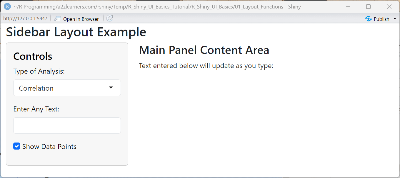
- Shows classic sidebar + main panel layout.
- Sidebar contains controls; main panel displays outputs.
- Demonstrates dynamic UI elements and user input handling.
library(shiny)
library(bslib)

ui <- fluidPage(
  theme = bs_theme(version = 5, bootswatch = "bootstrap"),

  titlePanel("Sidebar Layout Example"),

  sidebarLayout(
    sidebarPanel(
      h4("Controls"),

      # Dropdown for analysis type
      selectInput(
        inputId = "analysis_type",
        label = "Type of Analysis:",
        choices = c("Correlation", "Distribution", "Comparison")
      ),

      # Simple textbox input
      textInput(
        inputId = "user_text",
        label = "Enter Any Text:",
        value = ""
      ),

      # Simple checkbox
      checkboxInput(
        inputId = "show_points",
        label = "Show Data Points",
        value = TRUE
      )
    ),

    mainPanel(
      h3("Main Panel Content Area"),
      p("Text entered below will update as you type:"),
      verbatimTextOutput("display_text")
    )
  )
)

server <- function(input, output, session) {
  # Display the value from the textbox
  output$display_text <- renderText({
    input$user_text
  })
}

shinyApp(ui, server)
4. Panels and Containers
Core Panel Functions: Shiny provides various panel functions for organizing content: titlePanel, sidebarPanel, mainPanel, wellPanel, tabsetPanel/tabPanel, and navlistPanel. Each serves specific organizational purposes in the UI hierarchy.
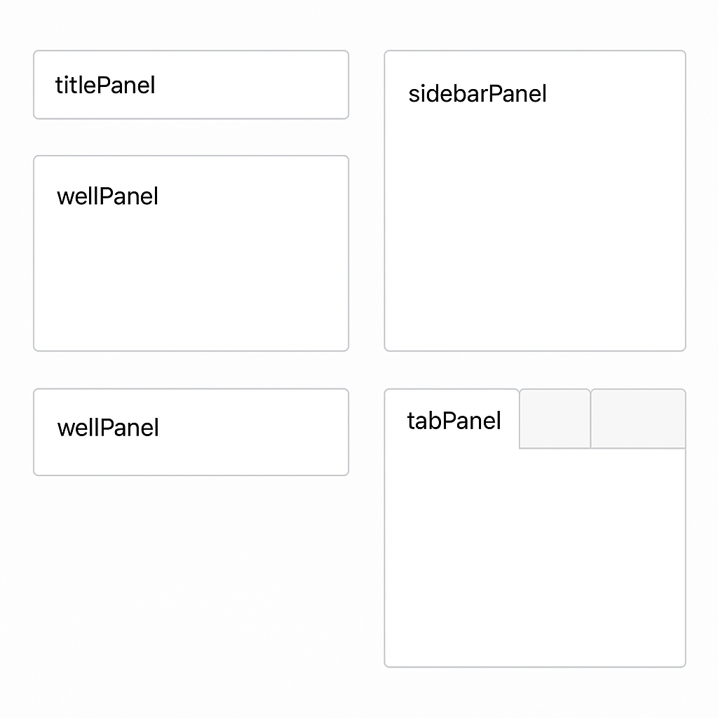
Component reference showing various Shiny panel types and their visual styling
Example with Multiple Panel Types:
- Demonstrates use of
wellPanel,sidebarPanel,mainPanel,tabsetPanel, andnavlistPanel. - Shows how to group controls and outputs for clarity.
- Useful for building complex, organized Shiny UIs.
library(shiny)

ui <- fluidPage(
  titlePanel("All Shiny Panel Types – Annotated Demo"),

  # Top-level wellPanel explanation
  wellPanel(
    h4("wellPanel (Top Level)"),
    p("A wellPanel adds a grey box around its contents for grouping and emphasis. Commonly used for instructions or overview.")
  ),

  sidebarLayout(
    sidebarPanel(
      wellPanel(
        h4("Sidebar wellPanel"),
        p("Groups related controls inside the sidebar."),
        selectInput("choice", "Select Option:", choices = c("A", "B", "C")),
        sliderInput("num", "Choose a Number:", 1, 100, 50)
      ),
      tags$hr(),
      h5("What is a sidebarPanel?"),
      p("sidebarPanel provides a left sidebar area, typically for controls. It is used inside sidebarLayout.")
    ),

    mainPanel(
      tabsetPanel(
        tabPanel("TabsetPanel: Tabs",
                 div(style = "margin-top: 15px;"),
                 h4("tabsetPanel"),
                 p("tabsetPanel creates tabs across the top, each displaying content in a separate page. Useful for switching between plots, tables, or settings."),
                 tags$hr(),
                 wellPanel(
                   h5("Nested wellPanel"),
                   p("This wellPanel is placed inside a tabPanel for extra grouping or emphasis.")
                 )
        ),
        tabPanel("NavlistPanel: Sidebar Tabs",
                 div(style = "margin-top: 15px;"),
                 h4("navlistPanel"),
                 p("navlistPanel displays a vertical, sidebar-style menu. You can group related panels and provide a clean multi-section approach for reports or analysis."),
                 tags$hr(),
                 navlistPanel(
                   "Analysis Options (navlistPanel Header)",
                   tabPanel("Summary Tab",
                            p("This is a navlistPanel tab: great for long forms or categorized options.")
                   ),
                   tabPanel("Details Tab",
                            p("Another item in the navlistPanel.")
                   ),
                   "Extra Section",
                   tabPanel("Extra Tab",
                            p("Section breaks and more tabs are fully supported.")
                   )
                 )
        )
      ),
      div(style = "margin: 30px 0 10px 0;"),
      tags$hr(),
      h5("What is a mainPanel?"),
      p("mainPanel is the right-side area of sidebarLayout for displaying your most important content—outputs, tabs, or navigation panels. Here it hosts the tabsetPanel and navlistPanel.")
    )
  )
)

server <- function(input, output, session) {}

shinyApp(ui, server)
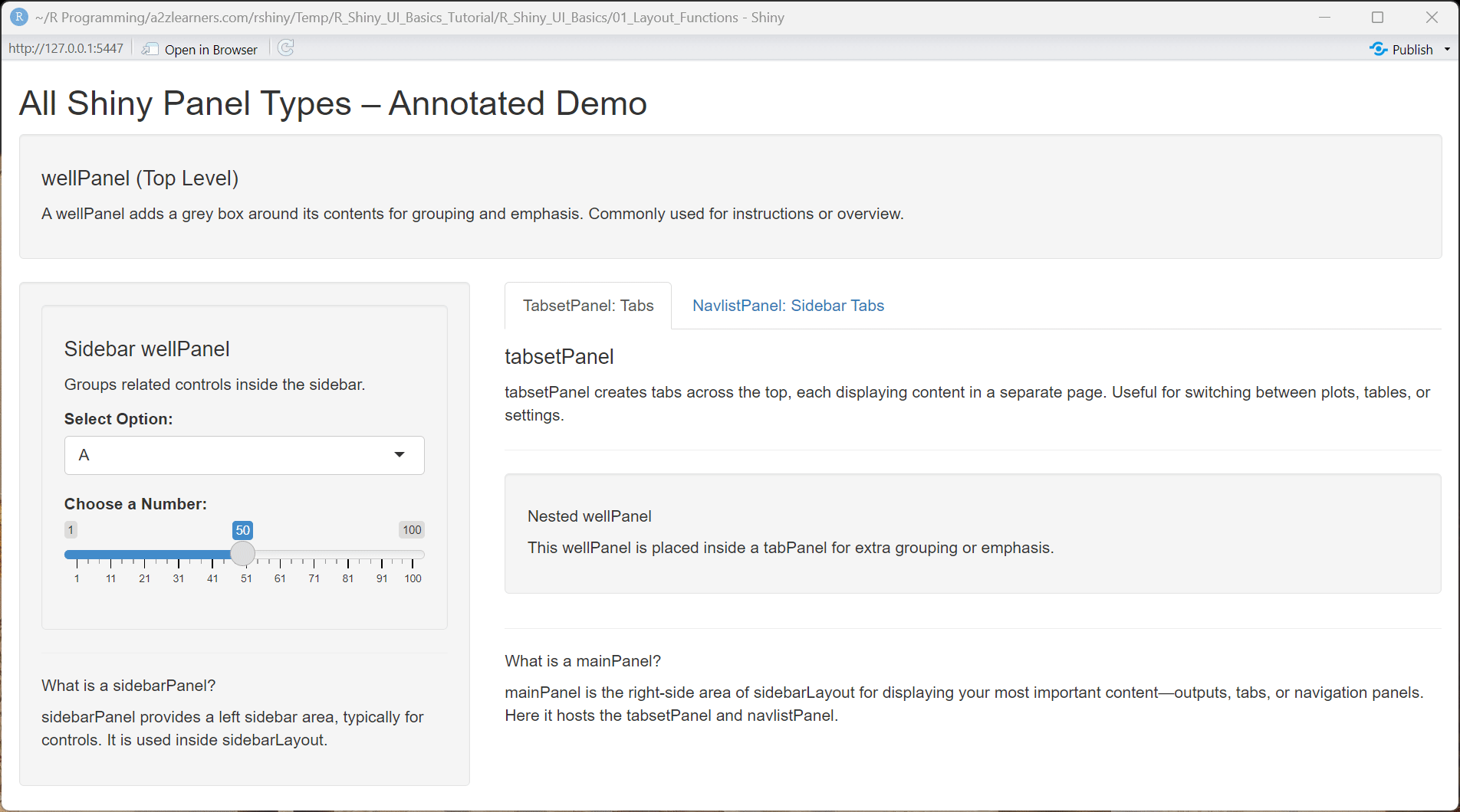
bslib Card-Based Dashboard Example:
- Uses
bslibfor modern card-based dashboard layouts. - Demonstrates metrics, controls, and status in separate cards.
- Shows how to display user input and outputs in a visually appealing way.
library(shiny)
library(bslib)

ui <- page_fillable(
  theme = bs_theme(version = 5, bootswatch = "minty"),

  # Page header
  div(class = "d-flex justify-content-between align-items-center mb-4",
      h1("Modern Card Dashboard", class = "mb-0"),
      span("Built with bslib", class = "text-muted")
  ),

  # Card-based layout
  layout_columns(
    fill = FALSE,
    col_widths = c(4, 4, 4),
    # Card 1: Metrics
    card(
      card_header(
        class = "d-flex justify-content-between",
        h5("Key Metrics", class = "mb-0"),
        icon("chart-line")
      ),
      card_body(
        div(class = "row text-center",
          div(class = "col-4",
            h3("42", class = "text-primary mb-0"),
            tags$small("Total Users")
          ),
          div(class = "col-4",
            h3("89%", class = "text-success mb-0"),
            tags$small("Success Rate")
          ),
          div(class = "col-4",
            h3("$1.2K", class = "text-info mb-0"),
            tags$small("Revenue")
          )
        )
      )
    ),
    # Card 2: Interactive Controls (now simple textbox)
    card(
      card_header(
        h5("Analysis Controls", class = "mb-0")
      ),
      card_body(
        textInput("user_text", "Enter any text:", value = ""),
        checkboxInput("show_option", "Show Option", value = TRUE)
      )
    ),
    # Card 3: Status
    card(
      card_header(
        h5("System Status", class = "mb-0")
      ),
      card_body(
        div(class = "d-flex align-items-center mb-2",
          span(class = "badge bg-success me-2", "●"),
          span("Database: Online")
        ),
        div(class = "d-flex align-items-center mb-2",
          span(class = "badge bg-warning me-2", "●"),
          span("API: Limited")
        ),
        div(class = "d-flex align-items-center",
          span(class = "badge bg-success me-2", "●"),
          span("Cache: Optimal")
        )
      )
    )
  ),

  # Full-width card to display entered text
  layout_columns(
    col_widths = 12,
    card(
      card_header(
        h5("Performance Overview", class = "mb-0")
      ),
      card_body(
        p("Below is the text entered by the user:"),
        verbatimTextOutput("display_text")
      )
    )
  )
)

server <- function(input, output, session) {
  output$display_text <- renderText({
    input$user_text
  })
}

shinyApp(ui, server)
Performance Notes: Avoid excessive nesting of panels as it creates complex DOM structures that can slow rendering. Use conditionalPanel strategically rather than hiding/showing multiple complex elements.
5. Titles, Headers, and Help Text
Typography Hierarchy: Proper use of titlePanel, h1-h4, tags$p, and helpText creates scannable, accessible interfaces. Consistent typography scales improve user comprehension and navigation.
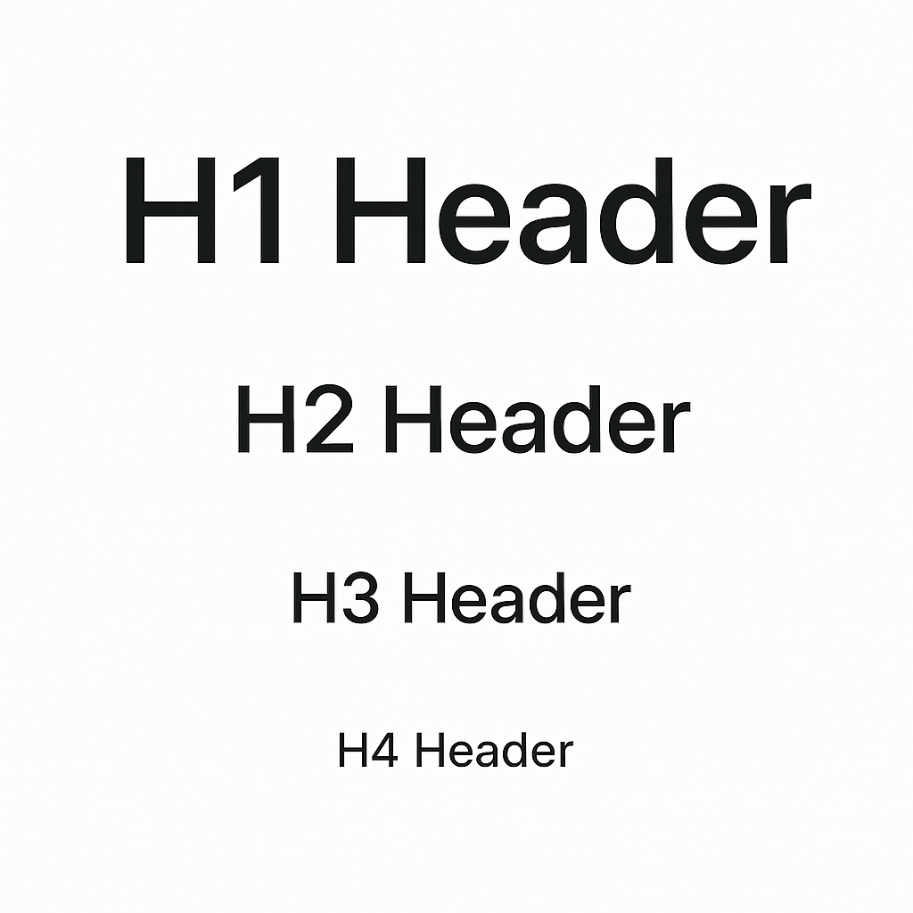
Typography hierarchy scale showing header levels h1-h4 for consistent design
Best Practices for Text Hierarchy:
- Use titlePanel for main application title
- Implement logical header progression (h1 → h2 → h3 → h4)
- Place helpText near related inputs for contextual guidance
- Consider ARIA labels for accessibility
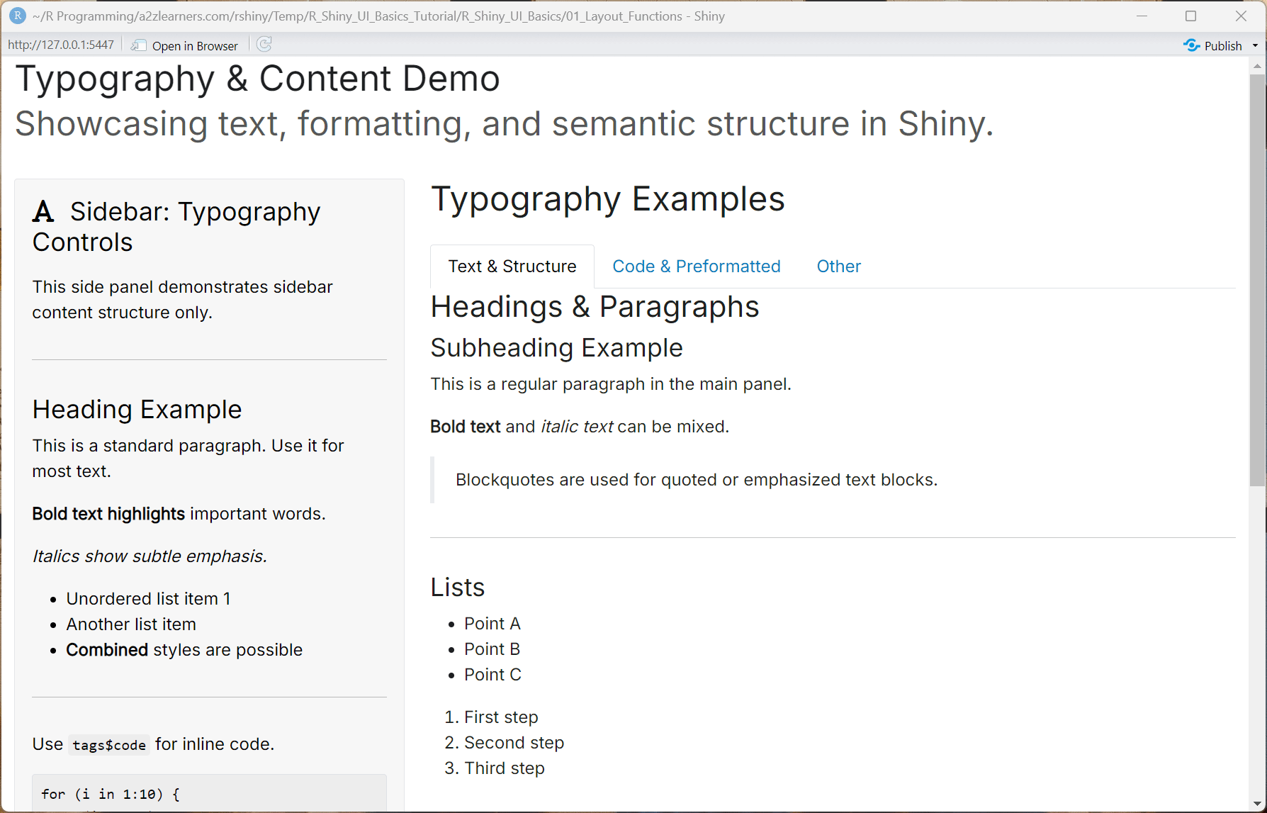
Complete Typography and Help Text Example:
library(shiny)
library(bslib)

ui <- fluidPage(
  theme = bs_theme(
    version = 5,
    base_font = font_google("Inter"),
    heading_font = font_google("Inter", wght = c(400, 600))
  ),
  titlePanel(
    title = div(
      h1("Typography & Content Demo", class = "mb-1"),
      p("Showcasing text, formatting, and semantic structure in Shiny.",
        class = "text-muted mb-0")
    ),
    windowTitle = "Typography Demo"
  ),
  br(),
  fluidRow(
    column(4,
           wellPanel(
             h2(icon("font", class = "me-2"), "Sidebar: Typography Controls", class = "h4 mb-3"),
             tags$p("This side panel demonstrates sidebar content structure only."),
             tags$hr(),
             tags$h4("Heading Example"),
             tags$p("This is a standard paragraph. Use it for most text."),
             tags$p(tags$strong("Bold text highlights"), "important words."),
             tags$p(tags$em("Italics show subtle emphasis.")),
             tags$ul(
               tags$li("Unordered list item 1"),
               tags$li("Another list item"),
               tags$li(tags$strong("Combined"), " styles are possible")
             ),
             tags$hr(),
             tags$p("Use ", tags$code("tags$code"), " for inline code."),
             tags$pre(
               "for (i in 1:10) {\n  cat(i, '\\n')\n}"
             ),
             tags$hr(),
             div(class = "alert alert-success mb-2",
                 icon("check-circle"),
                 tags$b("Sidebar done: customize content here!"))
           )
    ),
    column(8,
           h2("Typography Examples", class = "mb-4"),
           tabsetPanel(
             tabPanel("Text & Structure",
                      h3("Headings & Paragraphs"),
                      h4("Subheading Example"),
                      p("This is a regular paragraph in the main panel."),
                      p(tags$b("Bold text"), " and ", tags$i("italic text"), " can be mixed."),
                      tags$blockquote("Blockquotes are used for quoted or emphasized text blocks."),
                      tags$hr(),
                      h4("Lists"),
                      tags$ul(
                        tags$li("Point A"),
                        tags$li("Point B"),
                        tags$li("Point C")
                      ),
                      tags$ol(
                        tags$li("First step"),
                        tags$li("Second step"),
                        tags$li("Third step")
                      ),
                      tags$hr(),
                      h4("Alerts, Callouts, & Notes"),
                      div(class = "alert alert-info",
                          icon("info-circle"),
                          "Info alert: Use for general guidance or tips."
                      ),
                      div(class = "alert alert-warning",
                          icon("exclamation-triangle"),
                          tags$b("Warning:"), "Pay close attention!"
                      ),
                      div(class = "alert alert-danger",
                          icon("triangle-exclamation"),
                          tags$b("Danger:"), "Example of an error or breaking warning."
                      ),
                      div(class = "alert alert-success",
                          icon("check-circle"),
                          "Success! Well done."
                      )
             ),
             tabPanel("Code & Preformatted",
                      h3("Inline Code"),
                      p("Use ", tags$code("tags$code('my_code')"), " for inline code."),
                      h3("Preformatted Block"),
                      tags$pre(
                        "my_function <- function(x) {\n  return(x^2)\n}"
                      )
             ),
             tabPanel("Other",
                      h3("Blockquote"),
                      tags$blockquote(
                        "This is a blockquote for calling out a quote, tip, or call-to-action.",
                        tags$footer(tags$small("— Source or attribution"))
                      ),
                      h3("Horizontal rule and spacing"),
                      p("Text above."),
                      tags$hr(),
                      p("Text below a horizontal line (separator)."),
                      h3("Small and Muted Text"),
                      p(tags$small("This is small help or comment text.")),
                      p(tags$span(class="text-muted", "This is muted grey text."))
             )
           ),
           tags$hr(),
           h5("Panels Used:"),
           p("This demo uses ",
             tags$b("wellPanel"), " (sidebar), ",
             tags$b("tabsetPanel/tabPanel"), " (main tabs), various ",
             tags$b("typography tags"), " (h1-h6, p, b, i, blockquote, code, hr, pre, small, span), and ",
             tags$b("Bootstrap alerts"),
             ". Experiment and copy any section into your app, or swap panels as needed.")
    )
  )
)

server <- function(input, output, session) {}

shinyApp(ui, server)
Accessibility and Responsive Tips
WCAG AA Compliance Essentials:
- Color contrast: Ensure 4.5:1 ratio for normal text, 3:1 for large text
- Focus states: Provide visible keyboard navigation indicators
- ARIA labels: Use semantic markup and screen reader support
- Keyboard navigation: Ensure all interactive elements are keyboard accessible
Responsive Design Considerations:
- Mobile breakpoints: Design for 320px, 768px, 1024px, and 1200px+ screens
- Column stacking: Use Bootstrap's responsive grid for automatic mobile optimization
- Avoid fixed heights: Allow content to flow naturally
- Test touch targets: Ensure 44px minimum size for mobile interactions
Accessibility Audit Checklist:
- Color contrast meets WCAG AA standards
- All images have descriptive alt text
- Form inputs have associated labels
- Focus indicators are visible and consistent
- Heading hierarchy is logical (h1 → h2 → h3)
- Interactive elements are keyboard accessible
- Screen reader can navigate the application
- Error messages are descriptive and helpful
- Content reflows properly on mobile devices
- Touch targets are appropriately sized
7. Final Checklist
7.1 Layout and Structure ✓
- Choose appropriate page function: fluidPage for responsive, fixedPage for consistent width, navbarPage for multi-section apps
- Implement logical grid structure: Use 12-column system effectively, avoid overly complex nesting
- Design mobile-first: Test layouts on different screen sizes, ensure touch-friendly interactions
- Optimize panel organization: Group related controls, use consistent spacing and alignment
7.2 Visual Hierarchy and Typography ✓
- Establish clear heading structure: Use titlePanel and h1-h4 in logical sequence
- Provide contextual help: Include helpText near inputs, implement tooltips for complex features
- Maintain consistent theming: Apply bslib themes, use coherent color schemes and typography
- Ensure readability: Adequate font sizes, proper contrast ratios, logical information flow
7.3 Accessibility and Usability ✓
- Meet WCAG AA standards: 4.5:1 contrast ratio, keyboard navigation, screen reader compatibility
- Label all interactive elements: Associate inputs with descriptive labels, provide alt text for images
- Design inclusive interactions: Minimum 44px touch targets, clear focus indicators, error messaging
- Test across devices: Verify functionality on desktop, tablet, and mobile platforms
7.4 Performance and Reactivity ✓
- Minimize DOM complexity: Avoid deep nesting, use conditionalPanel strategically
- Implement efficient reactivity: Use isolate() for expensive operations, structure reactive dependencies logically
- Optimize render performance: Lazy load components when possible, cache expensive computations
- Monitor resource usage: Profile application performance, optimize data handling and visualization rendering
This comprehensive foundation in Shiny UI basics provides the essential knowledge for building professional, accessible, and performant web applications. The principles, patterns, and practices outlined here will support the development of sophisticated data-driven interfaces that serve users effectively across diverse contexts and devices.
**Resource download links**
3.1.3.-User-Interface-UI-Basics.zip