3.1.5. Introduction to Output Rendering
R Shiny is a powerful web application framework for R that enables the development of interactive web applications directly from R. One of the key aspects that makes Shiny so versatile is its output rendering system. This blog post explores the various output types in Shiny, how to implement them effectively, and advanced customization techniques to create stunning, interactive applications.
Output rendering in Shiny follows a reactive paradigm where outputs automatically update when their associated inputs change. Understanding how to leverage different output types is crucial for creating responsive, data-driven applications that effectively communicate insights.
1. Text Outputs
1.1. Understanding Text Output Functions
Shiny provides two primary functions for rendering text:
- textOutput: Renders regular text with HTML formatting
- verbatimTextOutput: Renders fixed-width (monospace) text, preserving formatting
These functions work in tandem with renderText() on the server side to display dynamic text content.
1.2. Basic Text Output Example
# UI Component
ui <- fluidPage(
  sliderInput("num", "Choose a number", min = 1, max = 100, value = 25),
  textOutput("simple_text"),
  verbatimTextOutput("code_text")
)

# Server Component
server <- function(input, output) {
  output$simple_text <- renderText({
    paste("You selected the number", input$num)
  })

  output$code_text <- renderText({
    paste("R calculation result:", sqrt(input$num))
  })
}

shinyApp(ui = ui, server = server)

1.3. Customizing Text Outputs
Text outputs can be customized using CSS and HTML:
ui <- fluidPage(
  sliderInput("num", "Choose a number", min = 1, max = 100, value = 25),
  tags$head(tags$style(HTML("
    #styled_text {
      color: blue;
      font-size: 20px;
      font-weight: bold;
    }
  "))),
  textOutput("styled_text")
)

server <- function(input, output) {
  output$styled_text <- renderText({
    paste("The square root of", input$num, "is", round(sqrt(input$num), 2))
  })
}

1.4. When to Use Each Type
- textOutput: Ideal for dynamic labels, results, and formatted text that integrates with your UI
- verbatimTextOutput: Perfect for displaying code, console output, or preserving whitespace
1.5. Best Practices for Text Output
- Keep text concise and meaningful
- Use verbatimTextOutput for displaying raw data or code snippets
- Consider text formatting for better readability
- Use conditional rendering for contextual information
2. Table Outputs
2.1. Basic Table Example
# UI Component
ui <- fluidPage(
  selectInput("dataset", "Choose a dataset:",
              choices = c("iris", "mtcars", "diamonds")),
  numericInput("obs", "Number of observations to display:", 10),
  tableOutput("static_table"),
  dataTableOutput("interactive_table")
)

# Server Component
server <- function(input, output) {
  # Dynamic data based on selection
  data_selected <- reactive({
    switch(input$dataset,
           "iris" = iris,
           "mtcars" = mtcars,
           "diamonds" = ggplot2::diamonds[sample(nrow(ggplot2::diamonds), 1000),])
  })

  # Static table output
  output$static_table <- renderTable({
    head(data_selected(), input$obs)
  })

  # Interactive table output
  output$interactive_table <- renderDataTable({
    data_selected()
  }, options = list(pageLength = input$obs))
}

shinyApp(ui = ui, server = server)

2.2. Advanced DataTable Features
The dataTableOutput function leverages the DataTables JavaScript library, providing numerous customization options:
library(shiny)
library(DT)

ui <- fluidPage(
  titlePanel("Advanced DataTable Features"),
  sidebarLayout(
    sidebarPanel(
      numericInput("rows", "Number of rows to display:", value = 10, min = 5, max = 100),
      checkboxInput("search", "Enable Search", value = TRUE),
      checkboxInput("ordering", "Enable Column Ordering", value = TRUE),
      checkboxInput("paging", "Enable Pagination", value = TRUE),
      checkboxInput("buttons", "Enable Export Buttons", value = TRUE)
    ),
    mainPanel(
      dataTableOutput("advanced_table")
    )
  )
)

server <- function(input, output, session) {
  output$advanced_table <- renderDataTable({
    datatable(
      mtcars,
      options = list(
        pageLength = input$rows,
        searching = input$search,
        ordering = input$ordering,
        paging = input$paging,
        dom = if (input$buttons) 'Blfrtip' else 'lfrtip',
        buttons = if (input$buttons) c('copy', 'csv', 'excel', 'pdf') else NULL,
        scrollX = TRUE,
        scrollY = '300px'
      ),
      extensions = if (input$buttons) 'Buttons' else character(0)
    )
  })
}

shinyApp(ui = ui, server = server)

2.3. Customizing Table Appearance
Tables can be styled using CSS or the built-in options:
library(shiny)

ui <- fluidPage(
  titlePanel("Customizing Table Appearance"),
  sidebarLayout(
    sidebarPanel(
      numericInput("rows", "Number of rows to display:",
                   value = 10, min = 5, max = 100),
      checkboxInput("striped", "Striped Rows", value = TRUE),
      checkboxInput("hover",   "Enable Hover Effect", value = TRUE),
      checkboxInput("bordered","Enable Borders", value = TRUE),
      selectInput("align", "Column Alignment",
                  choices = c("Left" = "l", "Center" = "c", "Right" = "r"),
                  selected = "c")
    ),
    mainPanel(
      tableOutput("styled_table")
    )
  )
)

server <- function(input, output, session) {
  output$styled_table <- renderTable(
    {
      head(mtcars, input$rows)
    },
    striped  = reactive(input$striped),
    hover    = reactive(input$hover),
    bordered = reactive(input$bordered),
    align    = reactive(input$align)
  )
}

shinyApp(ui, server)

2.4. Best Practices for Table Outputs
- Use tableOutput for small, simple datasets
- Use dataTableOutput for larger datasets that benefit from searching, filtering, and pagination
- Include download options for data tables when users might need the data for offline analysis
- Consider conditional formatting to highlight important values
- Implement server-side processing for very large datasets to improve performance
3. Plot Outputs
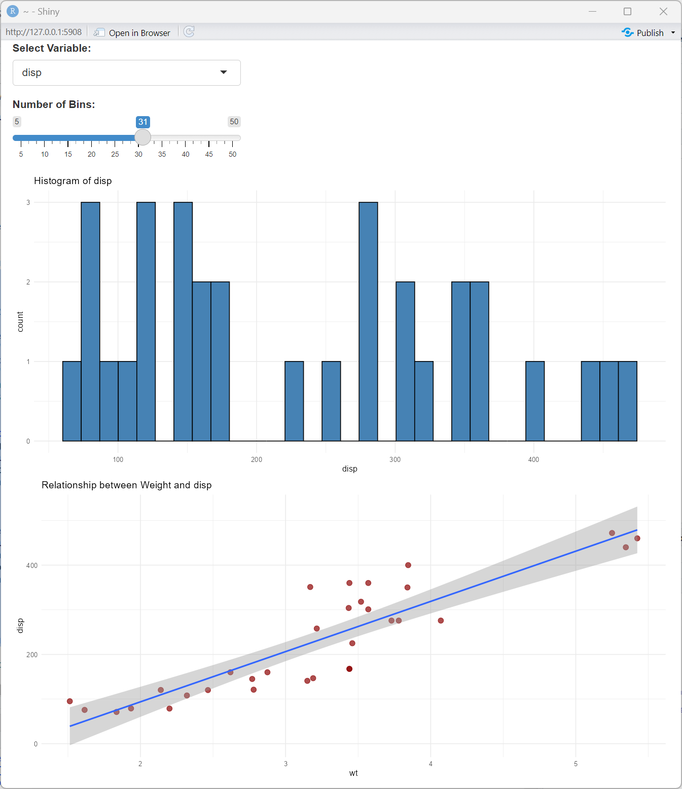
3.1. Basic Plot Output
# UI Component
ui <- fluidPage(
  selectInput("var", "Select Variable:",
              choices = names(mtcars)[c(1, 3, 4, 5, 6)]),
  sliderInput("bins", "Number of Bins:", min = 5, max = 50, value = 20),
  plotOutput("histogram", height = "400px"),
  plotOutput("scatter", height = "400px")
)

# Server Component
server <- function(input, output) {
  output$histogram <- renderPlot({
    ggplot(mtcars, aes_string(x = input$var)) +
      geom_histogram(bins = input$bins, fill = "steelblue", color = "black") +
      theme_minimal() +
      labs(title = paste("Histogram of", input$var))
  })

  output$scatter <- renderPlot({
    ggplot(mtcars, aes_string(x = "wt", y = input$var)) +
      geom_point(color = "darkred", size = 3, alpha = 0.7) +
      geom_smooth(method = "lm", se = TRUE) +
      theme_minimal() +
      labs(title = paste("Relationship between Weight and", input$var))
  })
}

shinyApp(ui = ui, server = server)
3.2. Interactive Plotly Visualizations
Plotly adds interactivity to your plots with tooltips, zooming, and more:
# Required libraries
library(plotly)

# UI Component
ui <- fluidPage(
  selectInput("var", "Select Y Variable:",
              choices = names(mtcars)[c(1, 3, 4, 5, 6)]),
  plotlyOutput("interactive_plot", height = "500px")
)

# Server Component
server <- function(input, output) {
  output$interactive_plot <- renderPlotly({
    p <- ggplot(mtcars, aes_string(x = "wt", y = input$var, color = "factor(cyl)")) +
      geom_point(size = 3) +
      labs(title = paste("Interactive Plot of Weight vs", input$var),
           color = "Cylinders") +
      theme_minimal()

    ggplotly(p) %>%
      layout(hovermode = "closest")
  })
}

shinyApp(ui = ui, server = server)

3.3. Image Output
For displaying images generated by R or external files:
# UI Component
ui <- fluidPage(
  selectInput("graph_type", "Select Graph Type:",
              choices = c("Mandelbrot Set", "Custom Image")),
  sliderInput("resolution", "Resolution:", min = 100, max = 800, value = 400),
  imageOutput("dynamic_image")
)

# Server Component
server <- function(input, output) {
  output$dynamic_image <- renderImage({
    if(input$graph_type == "Mandelbrot Set") {
      # Create a temporary file for the image
      outfile <- tempfile(fileext = '.png')

      # Generate Mandelbrot set
      png(outfile, width = input$resolution, height = input$resolution)
      x <- seq(-2, 1, length.out = input$resolution)
      y <- seq(-1.5, 1.5, length.out = input$resolution)
      mandelbrot <- outer(x, y, function(x, y) {
        c <- complex(real = x, imaginary = y)
        z <- 0
        for (i in 1:30) {
          z <- z^2 + c
          if (abs(z) > 2) break
        }
        return(i)
      })
      image(mandelbrot, col = terrain.colors(30))
      dev.off()

      # Return a list with the information needed by renderImage
      list(src = outfile,
           contentType = 'image/png',
           width = input$resolution,
           height = input$resolution,
           alt = "Mandelbrot Set")
    } else {
      # Return a sample image
      list(src = "www/sample_image.jpg",
           contentType = 'image/jpeg',
           width = input$resolution,
           height = input$resolution,
           alt = "Sample Image")
    }
  }, deleteFile = TRUE)
}

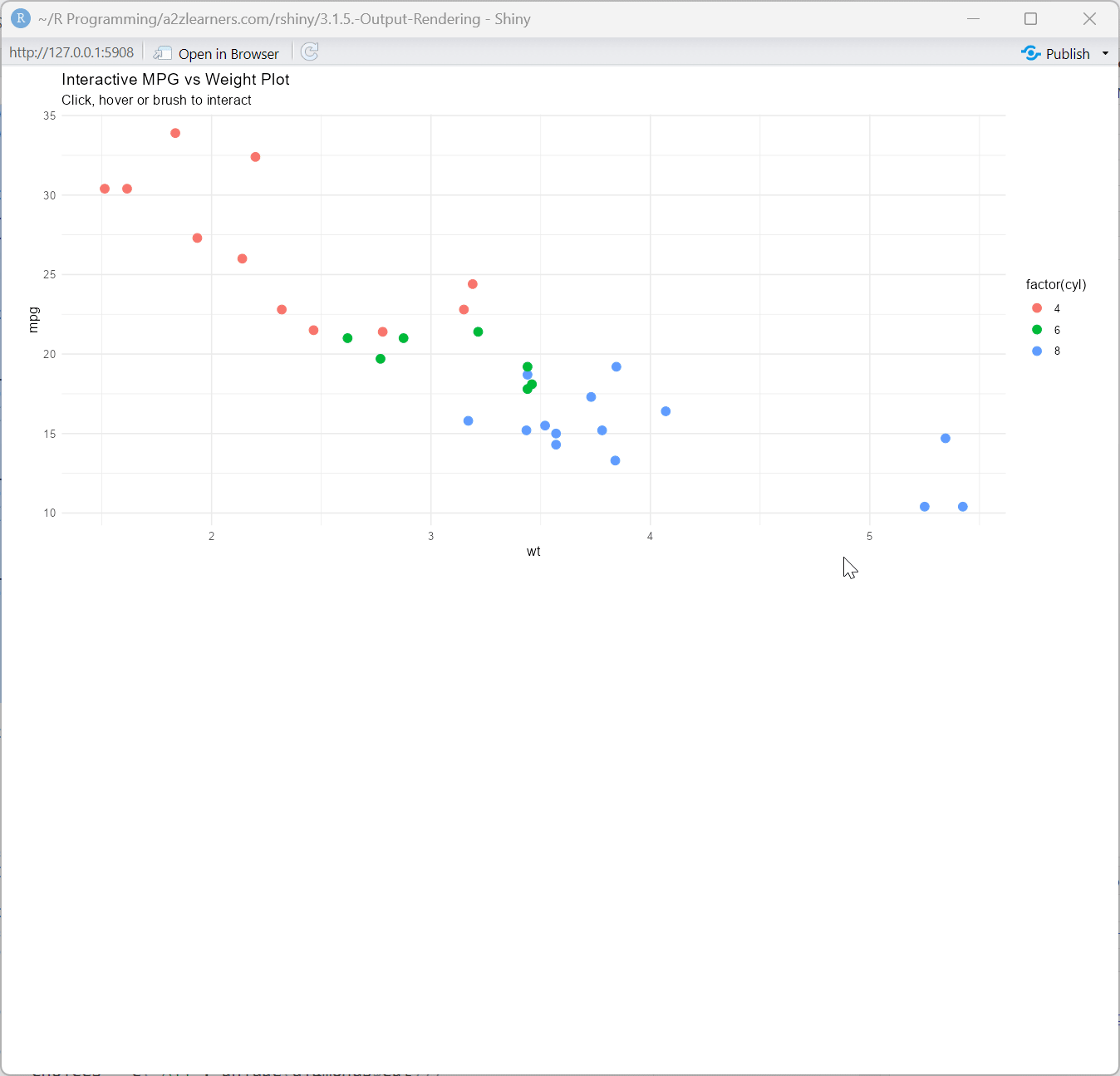
3.4. Plot Interactivity
Adding click, hover, and brush events to plots:
# UI Component
ui <- fluidPage(
  plotOutput("interactive_scatter",
             click = "plot_click",
             hover = "plot_hover",
             brush = "plot_brush"),
  verbatimTextOutput("click_info"),
  verbatimTextOutput("hover_info"),
  verbatimTextOutput("brush_info")
)

# Server Component
server <- function(input, output) {
  output$interactive_scatter <- renderPlot({
    ggplot(mtcars, aes(wt, mpg, color = factor(cyl))) +
      geom_point(size = 3) +
      theme_minimal() +
      labs(title = "Interactive MPG vs Weight Plot",
           subtitle = "Click, hover or brush to interact")
  })

  output$click_info <- renderPrint({
    req(input$plot_click)
    nearPoints(mtcars, input$plot_click, addDist = TRUE)
  })

  output$hover_info <- renderPrint({
    req(input$plot_hover)
    nearPoints(mtcars, input$plot_hover, addDist = TRUE)
  })

  output$brush_info <- renderPrint({
    req(input$plot_brush)
    brushedPoints(mtcars, input$plot_brush)
  })
}
3.5. Best Practices for Plot Outputs
- Use appropriate plot dimensions based on the complexity of your visualization
- Consider device pixel ratio for high-resolution displays
- Implement caching for complex plots to improve performance
- Add meaningful titles, labels, and legends
- Use interactive plots when exploration is important
- Include download options for plots
4. HTML and UI Outputs
4.1. Basic HTML Output
# UI Component
ui <- fluidPage(
  textInput("html_content", "Enter HTML content:",
            value = "<h3>Hello <span style='color:red;'>Shiny</span>!</h3>"),
  htmlOutput("html_render")
)

# Server Component
server <- function(input, output) {
  output$html_render <- renderUI({
    HTML(input$html_content)
  })
}

shinyApp(ui = ui, server = server)

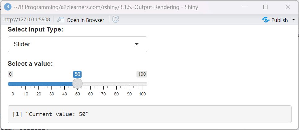
4.2. Dynamic UI Elements
The real power of uiOutput comes from dynamically generating UI elements:
# UI Component
ui <- fluidPage(
  selectInput("input_type", "Select Input Type:",
              choices = c("Slider", "Numeric", "Text", "Date")),
  uiOutput("dynamic_input"),
  verbatimTextOutput("input_value")
)

# Server Component
server <- function(input, output, session) {
  output$dynamic_input <- renderUI({
    switch(input$input_type,
           "Slider" = sliderInput("dynamic", "Select a value:",
                                 min = 0, max = 100, value = 50),
           "Numeric" = numericInput("dynamic", "Enter a number:",
                                   value = 0),
           "Text" = textInput("dynamic", "Enter text:",
                             value = ""),
           "Date" = dateInput("dynamic", "Select a date:",
                             value = Sys.Date())
    )
  })

  output$input_value <- renderPrint({
    if(!is.null(input$dynamic)) {
      paste("Current value:", input$dynamic)
    }
  })
}

shinyApp(ui = ui, server = server)
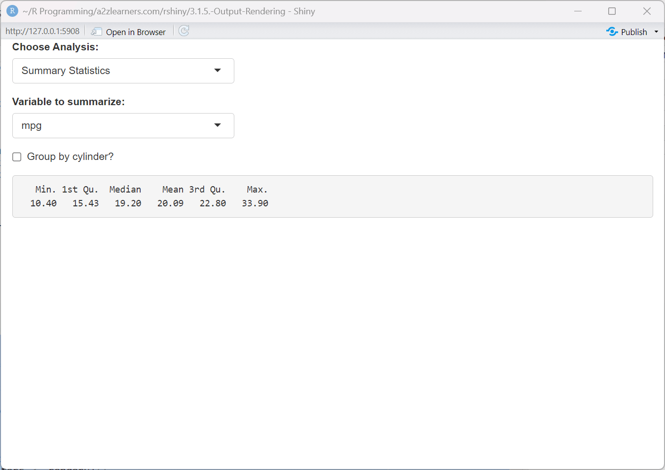
4.3. Conditional UI Components
Create interfaces that adapt based on user selections:
# UI Component
ui <- fluidPage(
  selectInput("analysis_type", "Choose Analysis:",
              choices = c("Summary Statistics", "Visualization", "Model")),
  uiOutput("parameters"),
  verbatimTextOutput("result")
)

# Server Component
server <- function(input, output, session) {
  output$parameters <- renderUI({
    switch(input$analysis_type,
           "Summary Statistics" = tagList(
             selectInput("summary_var", "Variable to summarize:",
                         choices = names(mtcars)),
             checkboxInput("include_groups", "Group by cylinder?", FALSE)
           ),
           "Visualization" = tagList(
             selectInput("plot_type", "Plot type:",
                         choices = c("Scatter", "Histogram", "Box")),
             selectInput("x_var", "X variable:", names(mtcars)),
             conditionalPanel(
               condition = "input.plot_type == 'Scatter'",
               selectInput("y_var", "Y variable:", names(mtcars))
             )
           ),
           "Model" = tagList(
             selectInput("model_type", "Model type:",
                         choices = c("Linear", "Logistic", "Random Forest")),
             selectInput("outcome", "Outcome variable:", names(mtcars)),
             checkboxGroupInput("predictors", "Predictor variables:",
                               choices = names(mtcars),
                               selected = names(mtcars)[1:3])
           )
    )
  })

  output$result <- renderPrint({
    req(input$analysis_type)

    if(input$analysis_type == "Summary Statistics" && !is.null(input$summary_var)) {
      if(!is.null(input$include_groups) && input$include_groups) {
        aggregate(mtcars[[input$summary_var]], by=list(Cylinder=mtcars$cyl), FUN=summary)
      } else {
        summary(mtcars[[input$summary_var]])
      }
    } else {
      "Configure options to see results"
    }
  })
}

shinyApp(ui = ui, server = server)
4.4. Best Practices for HTML and UI Outputs
- Use htmlOutput for custom formatted text and simple HTML elements
- Use uiOutput for dynamic UI generation that depends on user input
- Cache complex UI elements that don't change frequently
- Consider performance implications of deeply nested dynamic UI components
- Implement proper validation to handle cases when inputs don't exist yet
- Use the
req()function to ensure prerequisites are available before rendering
5. Interactive Widgets
5.1. Custom Interactive Components
Combining outputs with JavaScript for custom interactivity:
# UI Component
ui <- fluidPage(
tags$head(
tags$script(HTML('
$(document).on("click", "#custom_button", function() {
Shiny.setInputValue("custom_click", Math.random(), {priority: "event"});
});
'))
),
htmlOutput("custom_widget"),
verbatimTextOutput("click_result")
)
# Server Component
server <- function(input, output, session) {
output$custom_widget <- renderUI({
tags$div(
class = "well",
tags$button(
id = "custom_button",
class = "btn btn-primary btn-lg",
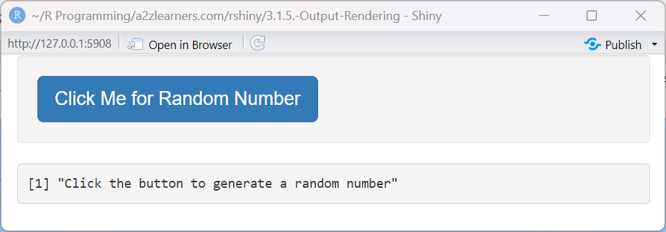
"Click Me for Random Number"
)
)
})
output$click_result <- renderPrint({
if(!is.null(input$custom_click)) {
paste("Random number generated:", input$custom_click)
} else {
"Click the button to generate a random number"
}
})
}
shinyApp(ui = ui, server = server)
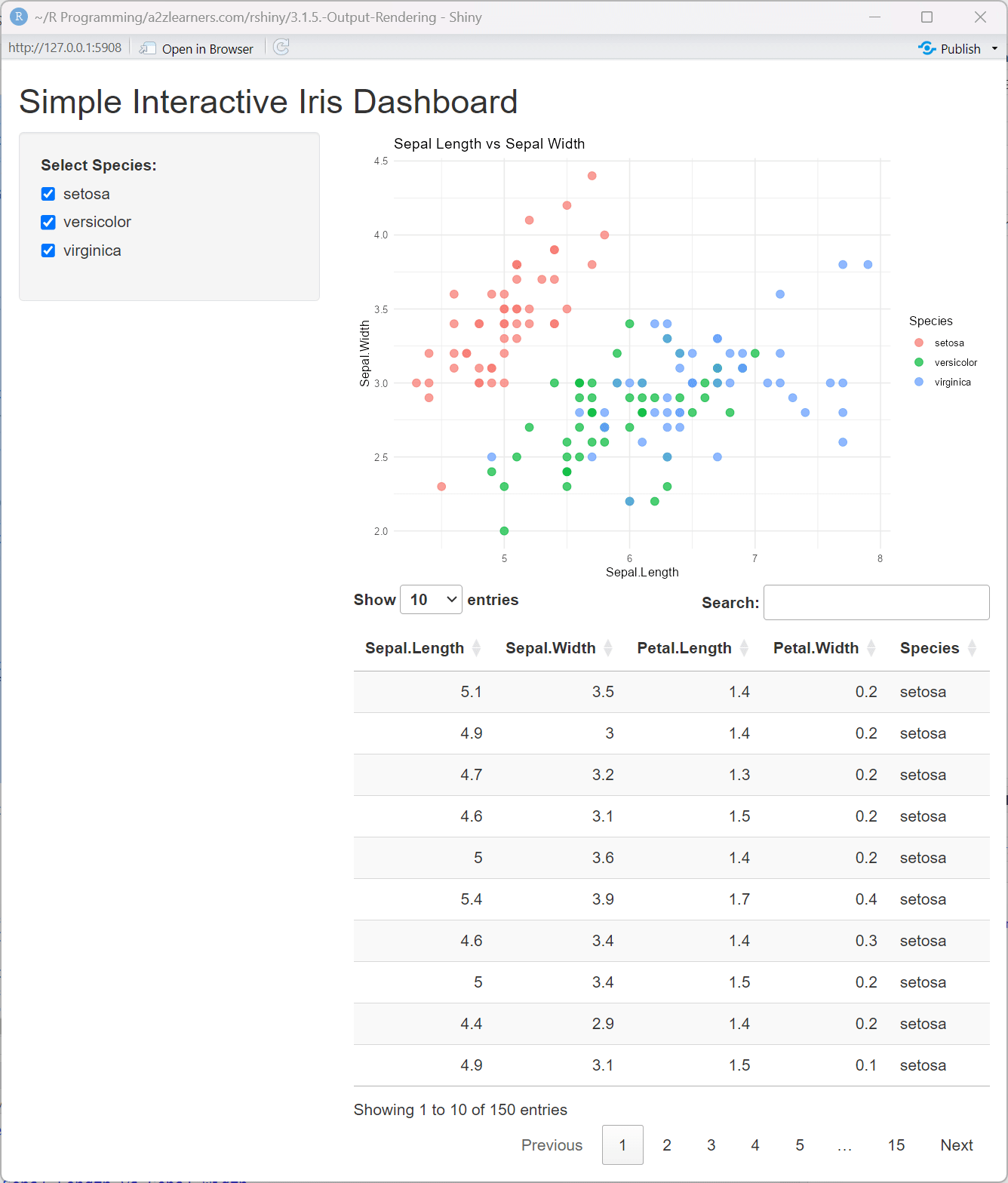
5.2. Interactive Data Visualization
Creating a dashboard with linked views:
library(ggplot2)
library(plotly)
library(DT)

# UI Component
ui <- fluidPage(
  titlePanel("Interactive Dashboard: Diamonds Dataset"),

  sidebarLayout(
    sidebarPanel(
      sliderInput("price_range", "Price Range:",
                  min = min(diamonds$price), max = max(diamonds$price),
                  value = c(min(diamonds$price), max(diamonds$price))),

      selectInput("color", "Diamond Color:",
                  choices = c("All", unique(diamonds$color))),

      selectInput("cut", "Diamond Cut:",
                  choices = c("All", unique(diamonds$cut)))
    ),

    mainPanel(
      plotlyOutput("scatter_plot"),
      plotlyOutput("bar_chart"),
      DTOutput("data_table")
    )
  )
)

# Server Component
server <- function(input, output, session) {

  # Filtered dataset based on inputs
  filtered_data <- reactive({
    data <- diamonds

    # Filter by price
    data <- data[data$price >= input$price_range[1] & data$price <= input$price_range[2],]

    # Filter by color if not "All"
    if(input$color != "All") {
      data <- data[data$color == input$color,]
    }

    # Filter by cut if not "All"
    if(input$cut != "All") {
      data <- data[data$cut == input$cut,]
    }

    # Sample if too large for performance
    if(nrow(data) > 5000) {
      data <- data[sample(nrow(data), 5000),]
    }

    return(data)
  })

  # Scatter plot of price vs. carat
  output$scatter_plot <- renderPlotly({
    req(filtered_data())
    p <- ggplot(filtered_data(), aes(x = carat, y = price, color = cut)) +
      geom_point(alpha = 0.7) +
      theme_minimal() +
      labs(title = "Diamond Price vs. Carat")

    ggplotly(p)
  })

  # Bar chart of count by clarity
  output$bar_chart <- renderPlotly({
    req(filtered_data())
    p <- ggplot(filtered_data(), aes(x = clarity, fill = cut)) +
      geom_bar() +
      theme_minimal() +
      labs(title = "Diamond Count by Clarity") +
      theme(axis.text.x = element_text(angle = 45, hjust = 1))

    ggplotly(p)
  })

  # Data table
  output$data_table <- renderDT({
    req(filtered_data())
    datatable(filtered_data(),
              options = list(pageLength = 10),
              rownames = FALSE)
  })
}

shinyApp(ui = ui, server = server)
5.3. Advanced Shiny Modules for Reusability
Creating reusable interactive components with Shiny modules:
# Define a filterable data table module
filterableDataTableUI <- function(id) {
  ns <- NS(id)
  tagList(
    fluidRow(
      column(4, textInput(ns("search"), "Search:")),
      column(4, numericInput(ns("entries"), "Entries per page:", 10, min = 5, max = 100))
    ),
    DTOutput(ns("table"))
  )
}

filterableDataTable <- function(input, output, session, data, columns = NULL) {
  output$table <- renderDT({
    filtered <- data

    # Apply search filter if provided
    if (!is.null(input$search) && input$search != "") {
      search_terms <- unlist(strsplit(input$search, " "))
      for (term in search_terms) {
        # Search across all columns that are character type
        char_cols <- sapply(filtered, is.character)
        if (any(char_cols)) {
          matches <- apply(filtered[, char_cols, drop = FALSE], 1, function(row) {
            any(sapply(row, function(x) grepl(term, x, ignore.case = TRUE)))
          })
          filtered <- filtered[matches, ]
        }
      }
    }

    datatable(
      filtered,
      options = list(
        pageLength = input$entries,
        searching = FALSE  # We handle search manually
      ),
      selection = "single"
    )
  })

  # Return reactive expression with selected row
  return(reactive({
    req(input$table_rows_selected)
    data[input$table_rows_selected, ]
  }))
}

# Main app using the module
ui <- fluidPage(
  titlePanel("Shiny Modules Example"),
  sidebarLayout(
    sidebarPanel(
      selectInput("dataset", "Choose Dataset:",
                  choices = c("iris", "mtcars")),
      verbatimTextOutput("selected_info")
    ),
    mainPanel(
      filterableDataTableUI("data_view")
    )
  )
)

server <- function(input, output, session) {
  # Get the selected dataset
  dataset <- reactive({
    switch(input$dataset,
           "iris" = iris,
           "mtcars" = mtcars)
  })

  # Initialize the module
  selected_row <- callModule(
    filterableDataTable,
    "data_view",
    data = dataset
  )

  # Display information about the selected row
  output$selected_info <- renderPrint({
    req(selected_row())
    selected_row()
  })
}

shinyApp(ui = ui, server = server)

5.4. Best Practices for Interactive Widgets
- Keep interactivity purposeful and intuitive
- Provide visual feedback for user actions
- Maintain consistent interaction patterns throughout your app
- Use tooltips or help text to explain complex interactions
- Test interactive elements with different screen sizes and devices
- Consider accessibility needs for interactive elements
- Use debouncing for inputs that could trigger expensive operations
6. Conclusion
Understanding Shiny's output rendering system is crucial for building effective, interactive data applications. By mastering the various output types and their customization options, you can create powerful, user-friendly applications that communicate insights effectively.
Remember these key takeaways:
- Match your output type to your data and visualization needs
- Use text outputs for simple information display
- Leverage tables for structured data presentation
- Implement interactive plots for data exploration
- Use HTML and UI outputs for custom components and dynamic interfaces
- Implement proper error handling for robust applications
- Optimize performance for production applications
By combining these techniques with thoughtful design and user experience considerations, you can create professional Shiny applications that effectively communicate insights and engage users.